Components/Framer Motion Components for React

Framer Motion Components for React

Every component in this collection animates with Motion, the library formerly known as Framer Motion. Copy the source, install it with the shadcn CLI, or remix it with AI.

Free component
Mood Tracker

Mood Tracker

A feelings check-in card with six expressive faces. Drag the segmented slider and the face, label, and liquid color wash shift with your mood.
View Component
Free component
Crypto Swap

Crypto Swap

A crypto token-swap widget with live exchange rates, price impact, and an animated swap button.

View Component
Free component
Product Card Deck

Product Card Deck

A draggable card deck you flick through one card at a time. The top card leans toward your drag, then spins away with momentum to reveal the next, and the deck loops endlessly. Every card pairs a picture with a title and a pill action button with hover and press states.

View Component
Free component
Interactive Card Stack

Interactive Card Stack

A scattered stack of photo cards. Drag, click, or arrow keys to focus any card.

View Component
Free component
Tilted Coverflow

Tilted Coverflow

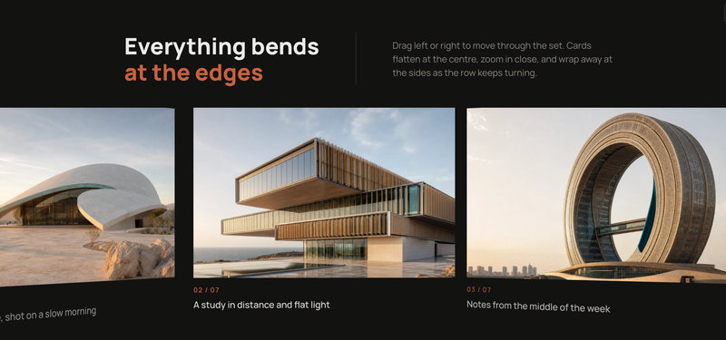
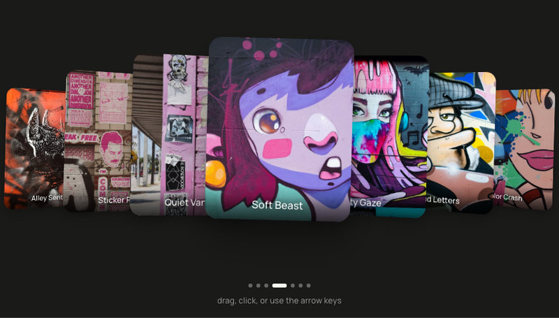
3D coverflow card carousel of seven tilted photos. Drag or arrows to focus any card.

View Component
Free component
Cube Carousel

Cube Carousel

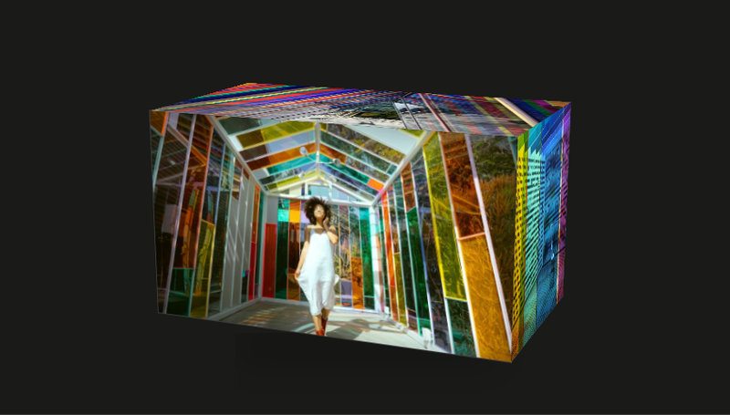
An interactive 3D photo cube with six placeholder images on its faces. Drag with your cursor to spin it freely on both axes; release and it coasts naturally to a stop. No buttons, no snap, no controls, just the cube and your hand.

View Component
Free component
Curious AI

Curious AI

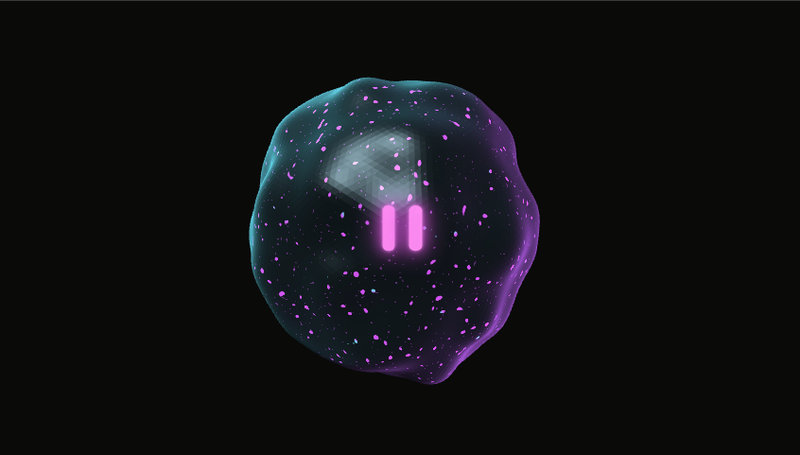
A morphing 3D AI orb in Three.js with cyan and magenta rim lights, iridescent pink speckles on a wrinkled surface, and glowing pink robot-eye pills that follow your cursor and blink between idle looks.

View Component
Free component
Signature Pad

Signature Pad

A signature pad widget — pill button morphs into a canvas to draw with mouse or touch.

View Component
Free component
Upload Progress

Upload Progress

A collapsible file upload widget with a shimmer progress bar — indigo while uploading, amber on pause. Expand to see per-file rows with live progress, time remaining, and pause, resume, refresh, and stop controls.

View Component
Free component
Live Session Pill

Live Session Pill

A compact live-session presence pill with an animated speaking indicator and overlapping avatars — clicks open a soft-UI modal showing all participants with a Join Now button.

View Component
Free component
New Project Modal

New Project Modal

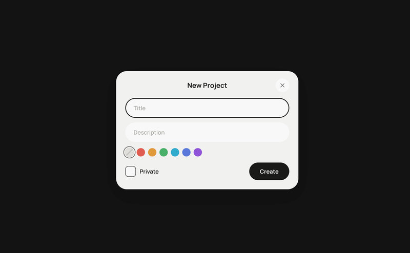
A pill button that morphs into a soft-UI project creation form — title, description, 7-swatch color label picker, Private toggle, and a checkmark-confirm Create button.

View Component
Free component
Radial Cards

Radial Cards

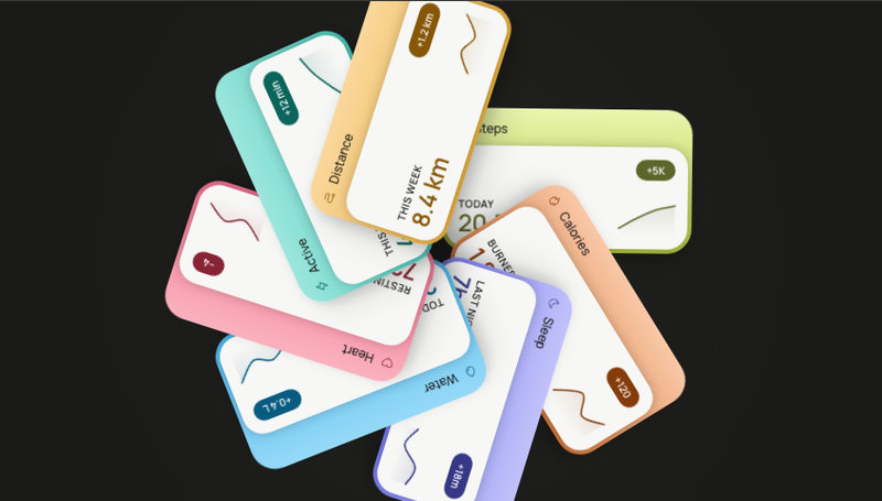
Seven health-metric cards bloom into a slowly rotating flower — tap any petal to pull it forward and read your stats up close.

View Component
Free component
Ripple Type

Ripple Type

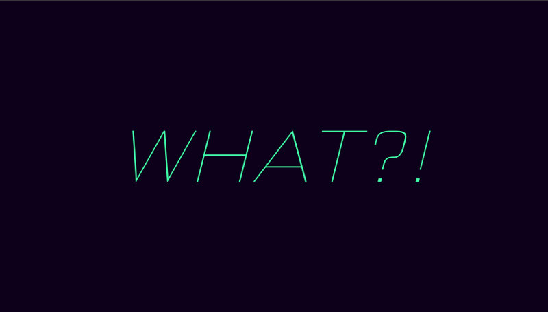
SVG text animation warped by a turbulence filter. Toggle the fan — letters ripple.

View Component
Free component
Stack Tower

Stack Tower

A column of 12 stacked words that reads as a rotating 3D cylinder — 2D transforms skew, scale and shift each row so the rotation travels down the stack. Hover lights one row in warm orange without breaking the rhythm.

View Component
Free component
Slice Type

Slice Type

A typographic magic trick. At rest you read one ambiguous word; hover and it splits into two — LIGHT lifting up, NIGHT sinking down, the shared letters resolving into separate glyphs.

View Component
Free component
Halo Type

Halo Type

Rotating 3D ring text animation — the front arc reads upright, the back arc upside-down.

View Component
Free component
Wild Morph

Wild Morph

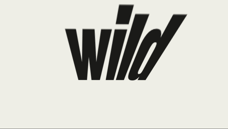
Italic SVG word that warps under the cursor — a spring-physics text animation.

View Component
Free component
Playful

Playful

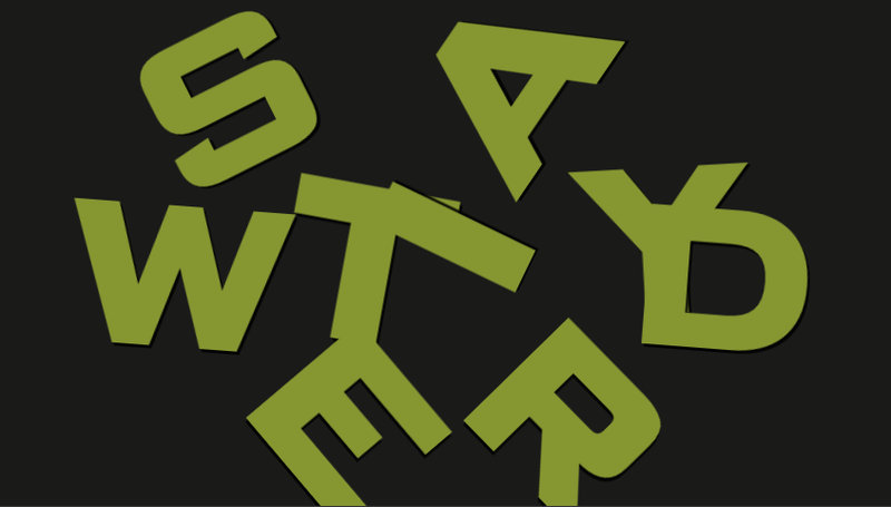
Kinetic typography where letters jump, drop, and rotate on cursor proximity.

View Component
Free component
Good Vibes

Good Vibes

Interactive typography where letters scale 2x and become bold on hover.

View Component
Free component
Responsive Letters

Responsive Letters

Interactive text where each letter responds to cursor proximity, animating variable font properties (weight, stretch, italic, letter-spacing, skew) to create a deformation-under-pressure effect.

View Component
Free component
Emoji Reaction Jar

Emoji Reaction Jar

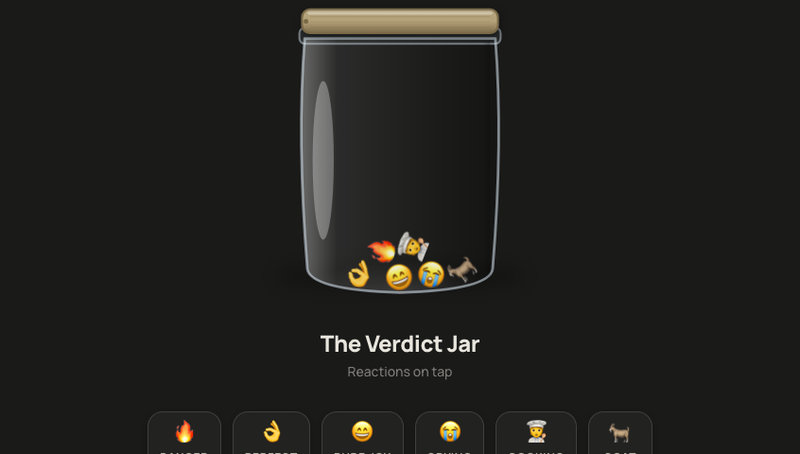
Glass jar widget. Click a reaction to spring the lid and watch the emoji bounce down.

View Component
Free component
Peel to Scan

Peel to Scan

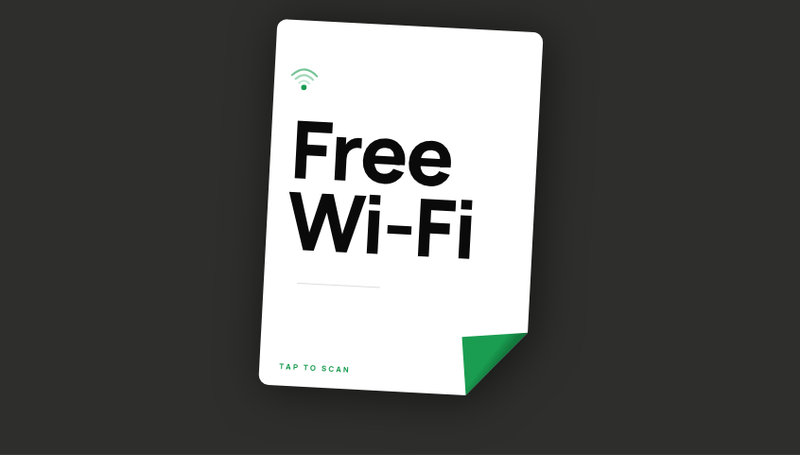
A portrait card whose corner peels on tap, revealing a scannable Wi-Fi QR code.

View Component
Free component
Sticker Wall

Sticker Wall

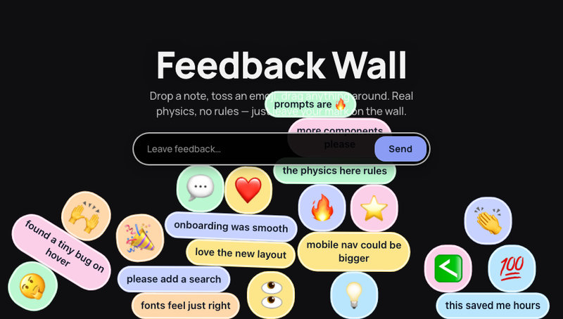
A draggable sticker card wall. Drop notes, toss emoji, pile them up with real 2D physics.

View Component
Free component
Danger Stripes

Danger Stripes

Three crossing caution-tape stripes on orange. Hover to shake, click to intensify.

View Component
Free component
AI Job Cards

AI Job Cards

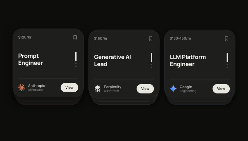
Three AI job card stacks with swipe-to-cycle. Brand logos, bookmark toggle, springs.

View Component
Free component
Label Cards

Label Cards

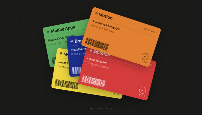
Colour-blocked label cards scattered at random angles. Tap one to spring it to centre.

View Component
Free component
Slide Deck

Slide Deck

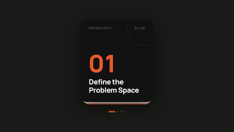
Swipeable card deck with four editorial slides. Navigate forward and back by drag or tap.

View Component
Free component
Task Cards

Task Cards

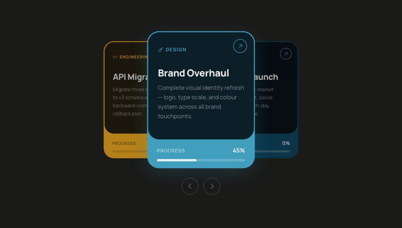
A swipeable project task card stack where each card has a unique accent colour, status badge, and due date. Drag left or right to cycle through tasks — springs back the dismissed card to the bottom of the deck.

View Component
Free component
Meet the Crew

Meet the Crew

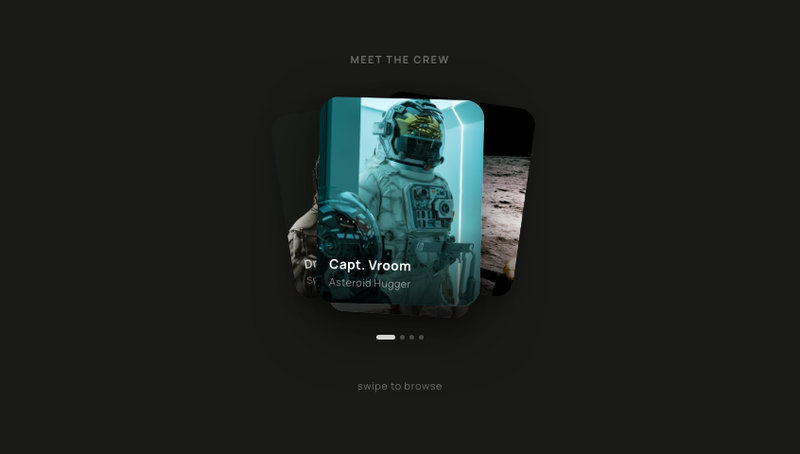
A swipeable portrait card stack perfect for introducing a team, showcasing crew members, or picking an avatar. Four stacked cards fan out with soft rotations — drag to browse, tap to choose. Drop in your own photos and names for an About Us section, a character selector, or an onboarding profile picker.

View Component
Free component
Glass AI Composer

Glass AI Composer

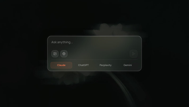
Glassmorphism AI chat input with image upload, web search toggle, and model switcher.

View Component
Free component
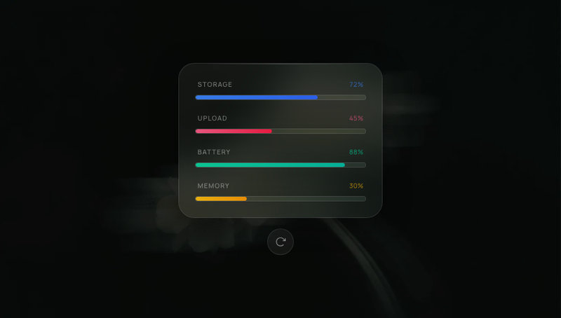
Glass Progress

Glass Progress

Glassmorphism progress bar panel with glowing gradient fills, spring-animated counters, staggered reveal, and replay button.

View Component
Free component
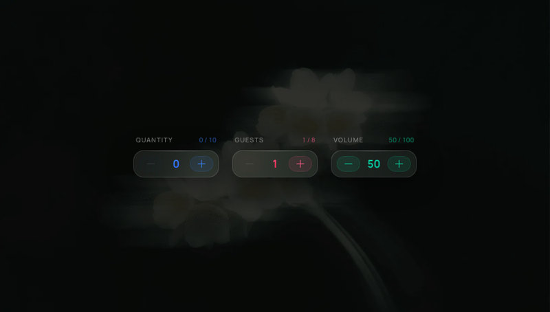
Glass Stepper

Glass Stepper

Glassmorphism numeric stepper with spring number flip, notification-style tinted buttons, and configurable min/max/step.

View Component
Free component
Glass Search Bar

Glass Search Bar

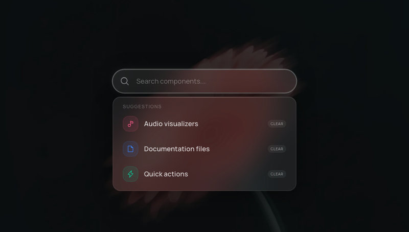
Glassmorphism search bar with animated suggestion dropdown, active state glow, and reduced-motion support.

View Component
Free component
Glass Toast

Glass Toast

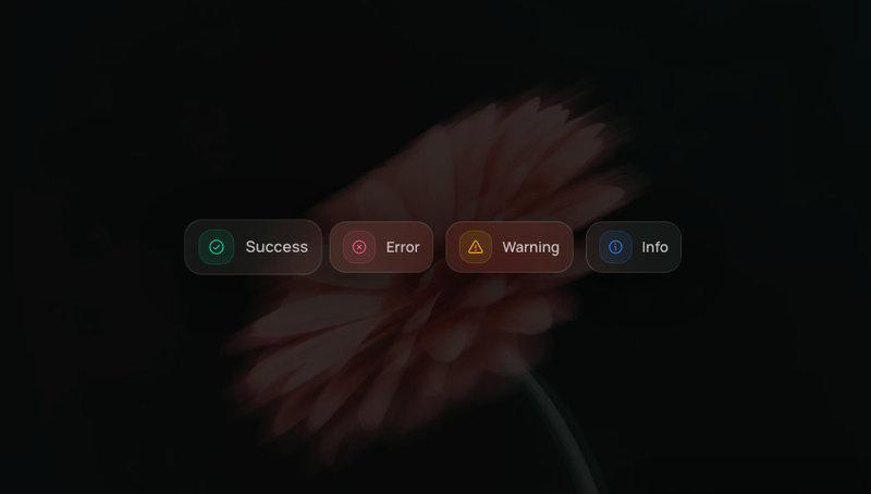
Frosted glassmorphism toast notification stack with 4 variants, auto-dismiss progress bar, and spring-animated stacking.

View Component
Free component
Glass User Menu

Glass User Menu

Frosted glass user avatar trigger with animated dropdown, grouped menu items, and Log Out.

View Component
Free component
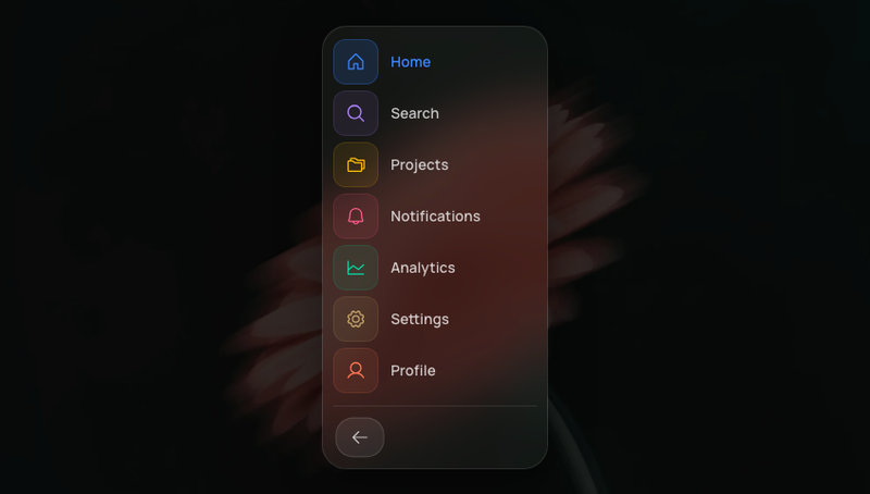
Glass Sidebar

Glass Sidebar

Collapsible glassmorphism sidebar with icon-only and full label states, spring-animated expand and collapse.

View Component
Free component
Glass Notifications

Glass Notifications

Swipe-to-dismiss notification stack with glass cards and spring-animated layout transitions.

View Component
Free component
Glass Music Player

Glass Music Player

Mini music player with glass surface, spinning vinyl art, animated progress bar, and ambient glow.

View Component
Free component
Glass Toggle

Glass Toggle

On/off toggles with glass housing and liquid-feel spring animation. Track color transitions smoothly.

View Component
Free component
Glass Slider

Glass Slider

Range sliders with glass tracks, glowing colored fills, and spring-animated thumbs that scale on drag.

View Component
Free component
Glass Dock

Glass Dock

Glassmorphism macOS-style dock with cursor-proximity magnification. Icons scale with spring physics as the mouse approaches.

View Component
Free component
Glass Modal

Glass Modal

Centered dialog with deep glass blur, scale-spring entrance, and staggered content reveal.

View Component
Free component
Glass Card

Glass Card

Glassmorphism content cards with 3D tilt-on-hover, spring physics, and a cursor-following glare highlight.

View Component
Free component
Glass Tags

Glass Tags

Selectable pill-shaped tags with glass surfaces, unique color accents, and spring-animated check marks.

View Component
Free component
Glass Tab Bar

Glass Tab Bar

Frosted glass pill tab bar with a sliding active indicator. Edge tabs snap flush to the container wall.

View Component
Free component
Glass Navbar

Glass Navbar

Frosted glass navigation bar with animated active tab indicator, ambient color blobs, and spring-physics entrance.

View Component
Free component
Emoji Burst

Emoji Burst

A button that explodes emojis outward in all directions. Five emoji sets cycle on each click.

View Component
Free component
Scramble Text

Scramble Text

Two words scramble continuously in a pixel cipher. Hover the container to decrypt them one by one — mouse out and they snap back to noise.

View Component
12 more components