Components/Buttons & Toggles

Animated React Buttons and Toggles

Animated buttons and toggle switches for React. Built with Tailwind CSS and Motion, ready to copy and paste or install via the shadcn CLI.
Free component
Andromeda Button

Andromeda Button

A sci-fi / blueprint-aesthetic button with five variants (default, outline, ghost, destructive, link), three sizes (small, medium, large), optional leading icon, and full hover / focus / active / disabled state coverage. Transparent hairline surfaces sit on a near-black canvas, with an electric-blue accent that brightens and glows on interaction.

View Component
Free component
Glass Toggle

Glass Toggle

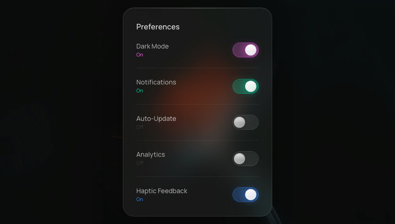
On/off toggles with glass housing and liquid-feel spring animation. Track color transitions smoothly.

View Component
Free component
Emoji Burst

Emoji Burst

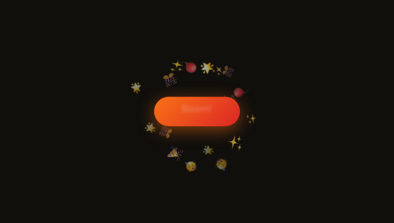
A button that explodes emojis outward in all directions. Five emoji sets cycle on each click.

View Component
Free component
Glitch Button

Glitch Button

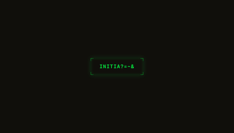
A terminal-inspired button with a text scramble glitch effect on hover.

View Component
Free component
Blind Pull Toggle

Blind Pull Toggle

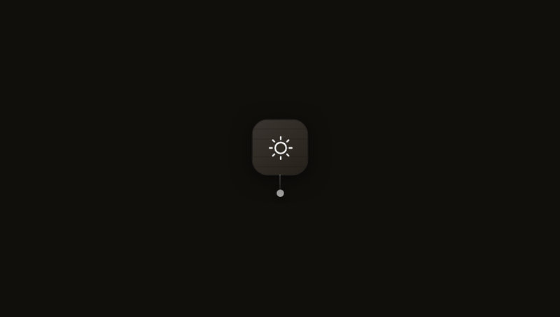
A dark/light mode toggle styled as a window-blind pull cord — click to yank the cord and watch the icon swap through a venetian-blind slat animation.

View Component
Free component
Taga Toggle

Taga Toggle

A playful pill toggle with an expressive face on the thumb — dead (×× eyes, flat mouth) when off, happy (arc eyes, big smile) when on. Track warms from grey to yellow.

View Component
Free component
Mark Toggle

Mark Toggle

An iOS-style pill toggle in warm earth and sand tones — the thumb carries a small icon that morphs from X to checkmark as it slides across.

View Component
Free component
Pill Toggle

Pill Toggle

A minimal iOS-style slider toggle — thumb glides between off (grey) and on (green) with a snappy spring. Fully responsive.

View Component