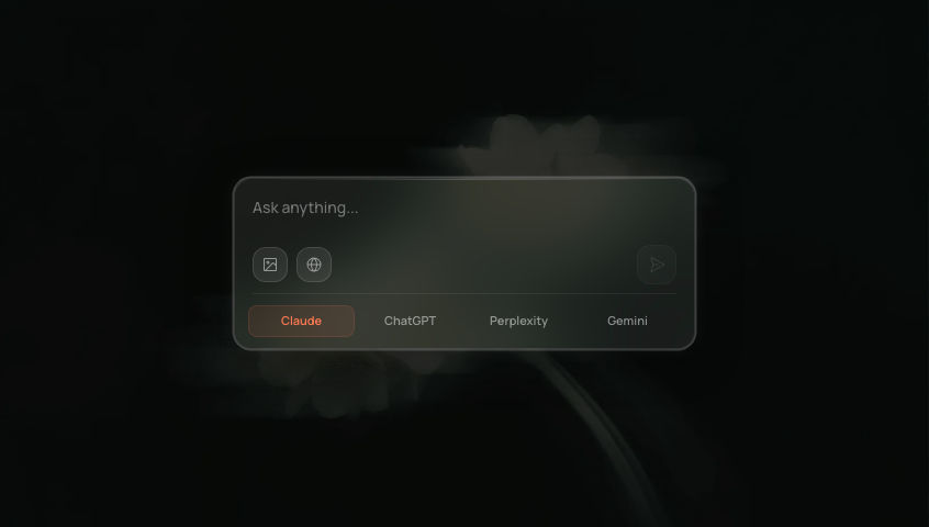
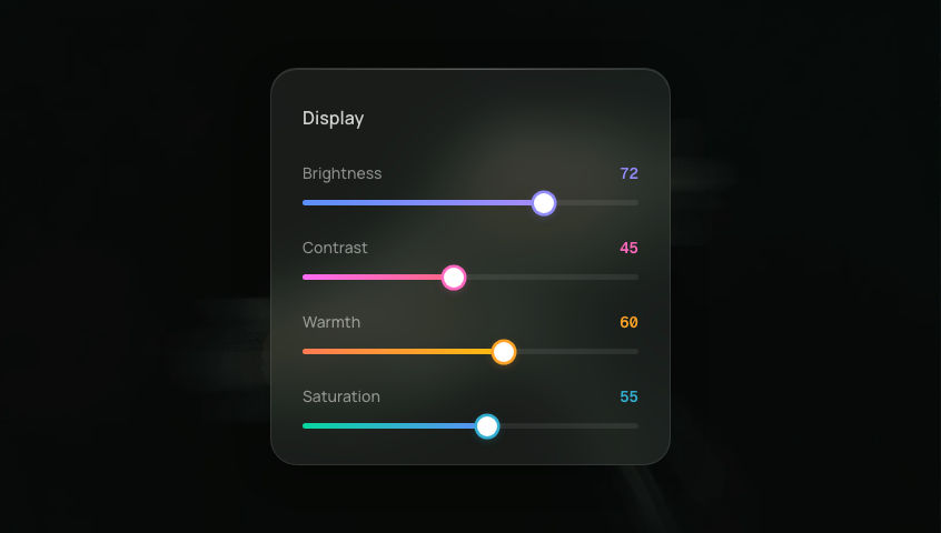
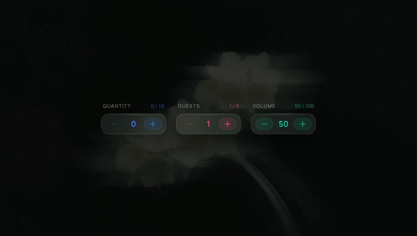
Glass Search BarGlassmorphism search bar with animated suggestion dropdown, active state glow, and reduced-motion support.
.png)
'use client'
// npm install @phosphor-icons/react framer-motion
import { useState, useRef, useEffect, useCallback } from 'react'
import { motion, AnimatePresence, useReducedMotion } from 'framer-motion'
import {
MagnifyingGlass,
X,
MusicNote,
File,
Lightning,
} from '@phosphor-icons/react'
// ─── Types ───────────────────────────────────────────────────────────────────
interface Suggestion {
icon: typeof MusicNote
label: string
color: string
}
// ─── Constants ───────────────────────────────────────────────────────────────
const BACKGROUND =
'https://ik.imagekit.io/aitoolkit/bg%20images/Ethereal%20pink%20Flower%20%20(1).png'
const SUGGESTIONS: Suggestion[] = [
{ icon: MusicNote, label: 'Audio visualizers', color: '#FF5C8A' },
{ icon: File, label: 'Documentation files', color: '#3A86FF' },
{ icon: Lightning, label: 'Quick actions', color: '#06D6A0' },
]
const BAR_HEIGHT = 48
const MIN_TOUCH_TARGET = 44
// ─── Glass family shared styles ─────────────────────────────────────────────
const glassBlur = {
backdropFilter: 'blur(24px) saturate(1.8)',
WebkitBackdropFilter: 'blur(24px) saturate(1.8)',
} as const
const glassPanel = {
background: 'rgba(255, 255, 255, 0.08)',
border: '1px solid rgba(255, 255, 255, 0.1)',
boxShadow:
'0 8px 40px rgba(0, 0, 0, 0.4), inset 0 1px 0 rgba(255, 255, 255, 0.08)',
} as const
// Active glow — white border + ambient glow
const ACTIVE_GLOW =
'0 8px 40px rgba(0, 0, 0, 0.4), inset 0 1px 0 rgba(255, 255, 255, 0.08), 0 0 0 1.5px rgba(255, 255, 255, 0.4), 0 0 20px rgba(255, 255, 255, 0.08)'
// ─── Suggestion Row ──────────────────────────────────────────────────────────
function SuggestionRow({
suggestion,
index,
reducedMotion,
onSelect,
onClear,
}: {
suggestion: Suggestion
index: number
reducedMotion: boolean
onSelect: (label: string) => void
onClear: (label: string) => void
}) {
const [hovered, setHovered] = useState(false)
const Icon = suggestion.icon
return (
<motion.div
initial={reducedMotion ? { opacity: 0 } : { opacity: 0 }}
animate={{ opacity: 1 }}
exit={{ opacity: 0 }}
transition={
reducedMotion
? { duration: 0.15 }
: { duration: 0.15, delay: 0.06 + index * 0.04 }
}
onMouseEnter={() => setHovered(true)}
onMouseLeave={() => setHovered(false)}
className="flex w-full items-center gap-3 rounded-xl px-3 py-2.5 font-sans"
style={{
minHeight: MIN_TOUCH_TARGET,
background: 'transparent',
}}
>
{/* Animated row: icon + label — scales and nudges right on hover */}
<motion.button
onClick={() => onSelect(suggestion.label)}
animate={
reducedMotion
? {}
: {
x: hovered ? 3 : 0,
scale: hovered ? 1.08 : 1,
}
}
whileTap={{ scale: 0.90 }}
transition={{ type: 'spring', stiffness: 320, damping: 20 }}
className="flex min-w-0 flex-1 cursor-pointer items-center gap-3"
style={{ background: 'transparent', transformOrigin: 'left center' }}
>
{/* Icon badge — notification-style tinted */}
<div
className="flex shrink-0 items-center justify-center rounded-xl"
style={{
width: 32,
height: 32,
background: `${suggestion.color}18`,
border: `1px solid ${suggestion.color}22`,
}}
>
<Icon size={16} weight="regular" style={{ color: suggestion.color }} />
</div>
<span
className="text-sm font-semibold font-sans"
style={{
color: hovered ? 'rgba(255,255,255,0.95)' : 'rgba(255,255,255,0.75)',
transition: 'color 0.15s',
}}
>
{suggestion.label}
</span>
</motion.button>
{/* Clear button — stays completely still */}
<button
onClick={(e) => { e.stopPropagation(); onClear(suggestion.label) }}
className="shrink-0 cursor-pointer rounded-full px-1.5 py-0.5 text-[8px] font-semibold uppercase tracking-wide text-white/40 font-sans"
style={{ background: 'rgba(255, 255, 255, 0.06)' }}
aria-label={`Clear ${suggestion.label}`}
>
Clear
</button>
</motion.div>
)
}
// ─── Main Component ──────────────────────────────────────────────────────────
export default function GlassSearchBar() {
const [isActive, setIsActive] = useState(false)
const [query, setQuery] = useState('')
const [hiddenSuggestions, setHiddenSuggestions] = useState<Set<string>>(new Set())
const containerRef = useRef<HTMLDivElement>(null)
const inputRef = useRef<HTMLInputElement>(null)
const prefersReduced = useReducedMotion()
const reducedMotion = prefersReduced ?? false
// Filtered suggestions based on query + hidden
const filteredSuggestions = SUGGESTIONS
.filter((s) => !hiddenSuggestions.has(s.label))
.filter((s) =>
query.trim() ? s.label.toLowerCase().includes(query.toLowerCase()) : true
)
// ─── Activate ────────────────────────────────────────────────────────
const activate = useCallback(() => {
setIsActive(true)
requestAnimationFrame(() => {
inputRef.current?.focus()
})
}, [])
// ─── Deactivate ──────────────────────────────────────────────────────
const deactivate = useCallback(() => {
setIsActive(false)
setQuery('')
inputRef.current?.blur()
}, [])
// ─── Click outside to deactivate ─────────────────────────────────────
useEffect(() => {
if (!isActive) return
function handleClickOutside(e: MouseEvent | TouchEvent) {
if (
containerRef.current &&
!containerRef.current.contains(e.target as Node)
) {
deactivate()
}
}
document.addEventListener('mousedown', handleClickOutside)
document.addEventListener('touchstart', handleClickOutside)
return () => {
document.removeEventListener('mousedown', handleClickOutside)
document.removeEventListener('touchstart', handleClickOutside)
}
}, [isActive, deactivate])
// ─── Escape key to deactivate ────────────────────────────────────────
useEffect(() => {
if (!isActive) return
function handleKeyDown(e: KeyboardEvent) {
if (e.key === 'Escape') deactivate()
}
document.addEventListener('keydown', handleKeyDown)
return () => document.removeEventListener('keydown', handleKeyDown)
}, [isActive, deactivate])
// ─── Handlers ────────────────────────────────────────────────────────
function handleClear() {
setQuery('')
inputRef.current?.focus()
}
function handleSuggestionSelect(label: string) {
setQuery(label)
inputRef.current?.focus()
}
function handleSuggestionClear(label: string) {
setHiddenSuggestions((prev) => new Set(prev).add(label))
}
const springOrFade = reducedMotion
? { duration: 0.15 }
: ({ type: 'spring', stiffness: 400, damping: 30 } as const)
return (
<div className="relative flex min-h-screen w-full items-center justify-center overflow-hidden bg-[#1A1A19]">
{/* Background image — consistent with glass family */}
<img
src={BACKGROUND}
alt=""
className="pointer-events-none absolute inset-0 h-full w-full object-cover opacity-60"
/>
{/* Outer container — fixed vertical position so bar doesn't jump when dropdown opens */}
<div
ref={containerRef}
className="absolute w-[calc(100%-2rem)] max-w-[380px]"
style={{ top: '30%', left: '50%', transform: 'translateX(-50%)' }}
>
{/* ─── Search bar ─────────────────────────────────────────── */}
<motion.div
animate={{
boxShadow: isActive ? ACTIVE_GLOW : glassPanel.boxShadow,
}}
transition={springOrFade}
onClick={!isActive ? activate : undefined}
className="relative isolate flex w-full cursor-text items-center rounded-3xl"
style={{
height: BAR_HEIGHT,
...glassPanel,
borderRadius: 24,
}}
>
{/* Blur layer */}
<div
className="pointer-events-none absolute inset-0 z-[-1]"
style={{ ...glassBlur, borderRadius: 24 }}
/>
{/* Search icon */}
<div
className="flex shrink-0 items-center justify-center"
style={{
width: BAR_HEIGHT,
height: BAR_HEIGHT,
minWidth: MIN_TOUCH_TARGET,
minHeight: MIN_TOUCH_TARGET,
}}
>
<MagnifyingGlass
size={20}
weight="regular"
className="text-white/50"
/>
</div>
{/* Input — always visible */}
<input
ref={inputRef}
value={query}
onChange={(e) => setQuery(e.target.value)}
onFocus={activate}
placeholder="Search components..."
className="min-w-0 flex-1 bg-transparent font-sans text-sm font-medium text-white/90 placeholder-white/30 outline-none"
style={{ caretColor: '#7D8D41' }}
aria-label="Search components"
/>
{/* Clear button — springs in when text is present */}
<AnimatePresence>
{query.length > 0 && (
<motion.button
key="clear"
initial={
reducedMotion
? { opacity: 0 }
: { opacity: 0, scale: 0.5 }
}
animate={
reducedMotion
? { opacity: 1 }
: { opacity: 1, scale: 1 }
}
exit={
reducedMotion
? { opacity: 0 }
: { opacity: 0, scale: 0.5 }
}
transition={springOrFade}
onClick={handleClear}
className="flex shrink-0 cursor-pointer items-center justify-center rounded-full"
style={{
width: 20,
height: 20,
marginRight: 14,
background: 'rgba(255, 255, 255, 0.08)',
border: '1px solid rgba(255, 255, 255, 0.12)',
}}
whileHover={{ backgroundColor: 'rgba(255, 255, 255, 0.14)' }}
whileTap={{ scale: 0.88 }}
aria-label="Clear search"
>
<X size={10} weight="regular" className="text-white/60" />
</motion.button>
)}
</AnimatePresence>
</motion.div>
{/* ─── Dropdown ───────────────────────────────────────────── */}
<AnimatePresence>
{isActive && filteredSuggestions.length > 0 && (
<motion.div
key="dropdown"
initial={
reducedMotion
? { opacity: 0 }
: { opacity: 0, scale: 0.95, y: -8, filter: 'blur(4px)' }
}
animate={
reducedMotion
? { opacity: 1 }
: { opacity: 1, scale: 1, y: 0, filter: 'blur(0px)' }
}
exit={
reducedMotion
? { opacity: 0 }
: { opacity: 0, scale: 0.95, y: -8, filter: 'blur(4px)' }
}
transition={
reducedMotion
? { duration: 0.15 }
: { type: 'spring', stiffness: 350, damping: 28 }
}
className="absolute left-0 right-0 rounded-2xl p-2"
style={{ ...glassPanel, ...glassBlur, transformOrigin: 'top center', top: BAR_HEIGHT + 8 }}
>
{/* Top edge highlight */}
<div
className="absolute left-6 right-6 top-0 h-[1px]"
style={{
background:
'linear-gradient(90deg, transparent, rgba(255,255,255,0.18), transparent)',
}}
/>
{/* Section label */}
<p className="mb-0.5 px-3 pt-1 text-[10px] font-semibold uppercase tracking-widest text-white/25 font-sans">
{query.trim() ? 'Results' : 'Suggestions'}
</p>
{/* Suggestion rows */}
{filteredSuggestions.map((suggestion, i) => (
<SuggestionRow
key={suggestion.label}
suggestion={suggestion}
index={i}
reducedMotion={reducedMotion}
onSelect={handleSuggestionSelect}
onClear={handleSuggestionClear}
/>
))}
</motion.div>
)}
</AnimatePresence>
</div>
</div>
)
}
Add to your project
One command adds this component to your project.
Run the following command. New project? Run npx shadcn@latest init first to set up Tailwind and path aliases.
npx shadcn@latest add @aicanvas/glass-search-barFor dark mode, add the dark class to your <html> element:
<html class="dark">Install with AI Canvas MCP
With AI Canvas MCP, your AI knows every component we ship. Ask for “a navigation component from AI Canvas” inside Claude Code, Codex, or Cursor and it can suggest you a few options, then install the one you like. Less typing, lower token cost, modern way to build.
Get MCPAbout Glass Search Bar
Glass Search Bar is a glassmorphism search field with an animated suggestion dropdown that opens on focus, an active-state glow when typing, and a reduced-motion fallback for users who prefer less animation. Motion handles the dropdown entrance and the focus-state highlight, while the glass surface uses backdrop-filter for the blur. It works well as a global search in SaaS shells, a sticky search header on marketing sites, and a command-palette trigger inside dashboards.