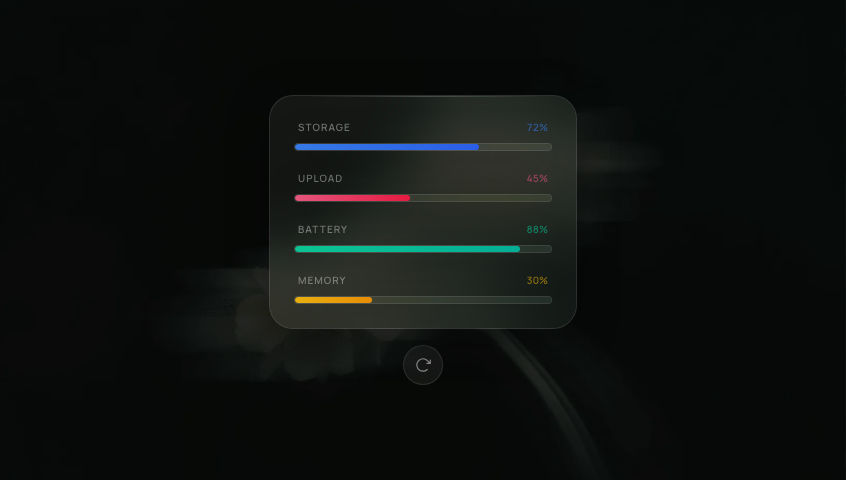
Charging WidgetCircular battery indicator with animated liquid waves that rise as the percentage counts up, looping continuously.
WidgetsFramer MotionSVG
Switch to light
Refresh
Full screen
'use client'
// npm install framer-motion
// font: Manrope
import { useLayoutEffect, useEffect, useRef, useState } from 'react'
import { useMotionValue, animate } from 'framer-motion'
const useIsomorphicLayoutEffect = typeof window !== 'undefined' ? useLayoutEffect : useEffect
// ─── ChargingWidget ───────────────────────────────────────────────────────────
// Circular battery-charging indicator with animated liquid waves that rise
// as the percentage counts up from 0 to 78, then loops.
// Supports both dark and light preview modes.
const TARGET_PERCENT = 78
const COUNT_DURATION = 4 // seconds
const PAUSE_DURATION = 1 // seconds between loops
export default function ChargingWidget() {
const containerRef = useRef<HTMLDivElement>(null)
const [isDark, setIsDark] = useState(() => typeof window !== 'undefined' ? document.documentElement.classList.contains('dark') : false)
useIsomorphicLayoutEffect(() => {
const el = containerRef.current
if (!el) return
const check = () => {
const card = el.closest('[data-card-theme]')
setIsDark(card ? card.classList.contains('dark') : document.documentElement.classList.contains('dark'))
}
check()
const observer = new MutationObserver(check)
observer.observe(document.documentElement, { attributes: true, attributeFilter: ['class'] })
const cardWrapper = el.closest('[data-card-theme]')
if (cardWrapper) observer.observe(cardWrapper, { attributes: true, attributeFilter: ['class'] })
return () => observer.disconnect()
}, [])
// Theme-derived colors
const WAVE1_COLOR = isDark ? 'rgba(120, 60, 220, 0.45)' : 'rgba(109, 40, 217, 0.28)'
const WAVE2_COLOR = isDark ? 'rgba(160, 80, 255, 0.70)' : 'rgba(124, 58, 237, 0.52)'
const RING_COLOR = isDark ? '#a855f7' : '#7c3aed'
const BG_CIRCLE_COLOR = isDark ? 'rgba(120, 60, 220, 0.10)' : 'rgba(130, 60, 220, 0.06)'
const TEXT_COLOR = isDark ? '#ffffff' : '#1C1916'
const TEXT_MUTED = isDark ? 'rgba(255,255,255,0.7)' : 'rgba(28,25,22,0.60)'
const BOLT_COLOR = isDark ? '#e0b0ff' : '#6d28d9'
// MotionValue for the animated percentage (0–78)
const percent = useMotionValue(0)
// Refs for direct DOM mutation (RAF-based wave animation)
const wave1Ref = useRef<SVGPathElement>(null)
const wave2Ref = useRef<SVGPathElement>(null)
const displayRef = useRef<SVGTextElement>(null)
const percentRef = useRef(0)
// Keep a mutable ref in sync with the MotionValue for RAF access
useEffect(() => {
const unsub = percent.on('change', (v) => {
percentRef.current = v
if (displayRef.current) {
displayRef.current.textContent = Math.round(v).toString()
}
})
return unsub
}, [percent])
// Count-up loop using Framer Motion animate
useEffect(() => {
let alive = true
async function run() {
while (alive) {
percent.set(0)
await animate(percent, TARGET_PERCENT, {
duration: COUNT_DURATION,
ease: 'easeInOut',
})
if (!alive) break
await new Promise<void>((resolve) => {
const timer = setTimeout(resolve, PAUSE_DURATION * 1000)
if (!alive) { clearTimeout(timer); resolve() }
})
if (!alive) break
}
}
run()
return () => { alive = false }
}, [percent])
// RAF wave animation — mutates SVG path refs directly, no React state
useEffect(() => {
let rafId: number
let offset1 = 0
let offset2 = 0
function buildWavePath(fillY: number, amp: number, phase: number): string {
let d = `M 0 ${fillY}`
for (let x = 0; x <= 200; x += 2) {
const y = fillY + Math.sin((x / 200) * 2 * Math.PI * 2 + phase) * amp
d += ` L ${x} ${y}`
}
d += ` L 200 200 L 0 200 Z`
return d
}
function tick() {
const pct = percentRef.current
const fillY = 200 - (pct / 100) * 200
const amp = 14 * (1 - pct / 100) + 4
offset1 += 0.025
offset2 -= 0.018
if (wave1Ref.current) {
wave1Ref.current.setAttribute('d', buildWavePath(fillY, amp, offset1))
}
if (wave2Ref.current) {
wave2Ref.current.setAttribute('d', buildWavePath(fillY, amp, offset2 + Math.PI))
}
rafId = requestAnimationFrame(tick)
}
rafId = requestAnimationFrame(tick)
return () => cancelAnimationFrame(rafId)
}, [])
const svgSize = 'min(260px, 56vw)'
return (
<div
ref={containerRef}
className="flex min-h-screen w-full items-center justify-center"
style={{ background: isDark ? '#110F0C' : '#F5F1EA' }}
>
<svg
viewBox="0 0 200 200"
style={{ width: svgSize, height: svgSize }}
aria-label={`Charging: ${TARGET_PERCENT}%`}
>
<defs>
{/* Clip to circle interior */}
<clipPath id="cw-circle-clip">
<circle cx="100" cy="100" r="88" />
</clipPath>
{/* Bolt glow */}
<filter id="cw-bolt-glow" x="-50%" y="-50%" width="200%" height="200%">
<feGaussianBlur in="SourceGraphic" stdDeviation="3" result="blur" />
<feComposite in="blur" in2="SourceGraphic" operator="over" />
</filter>
</defs>
{/* Background circle */}
<circle cx="100" cy="100" r="88" fill={BG_CIRCLE_COLOR} />
{/* Wave group — clipped to circle */}
<g clipPath="url(#cw-circle-clip)">
<path ref={wave1Ref} fill={WAVE1_COLOR} d="M 0 200 L 200 200 L 200 200 L 0 200 Z" />
<path ref={wave2Ref} fill={WAVE2_COLOR} d="M 0 200 L 200 200 L 200 200 L 0 200 Z" />
</g>
{/* Ring */}
<circle cx="100" cy="100" r="88" fill="none" stroke={RING_COLOR} strokeWidth="3" />
{/* Lightning bolt */}
<g transform="translate(100, 52) scale(0.7)" filter="url(#cw-bolt-glow)">
<path
d="M 8 -20 L -8 2 L 0 2 L -8 20 L 8 -2 L 0 -2 Z"
fill={BOLT_COLOR}
strokeLinejoin="round"
/>
</g>
{/* Percentage number — direct DOM text updated by RAF/MotionValue */}
<text
ref={displayRef}
x="100"
y="118"
textAnchor="middle"
dominantBaseline="middle"
fill={TEXT_COLOR}
fontSize="42"
fontWeight="800"
fontFamily="Manrope, sans-serif"
letterSpacing="-1"
>
0
</text>
{/* % sign below number */}
<text
x="100"
y="140"
textAnchor="middle"
dominantBaseline="middle"
fill={TEXT_MUTED}
fontSize="14"
fontWeight="600"
fontFamily="Manrope, sans-serif"
>
%
</text>
</svg>
</div>
)
}
Add to your project
One command adds this component to your project.
1
Run the following command. New project? Run npx shadcn@latest init first to set up Tailwind and path aliases.
npx shadcn@latest add @aicanvas/charging-widget2
For dark mode, add the dark class to your <html> element:
<html class="dark">3
This component uses Manrope. Add it to your project:
Optional<link href="https://fonts.googleapis.com/css2?family=Manrope:wght@400;500;600;700;800&display=swap" rel="stylesheet">