Components & Blocks/Blocks
Composed, multi-component page sections for React: pricing tables, hero banners, and more. Built with Tailwind CSS and Motion, some free and some premium.
A full-bleed, scroll-driven photo gallery. Each photo wipes in from a different edge.
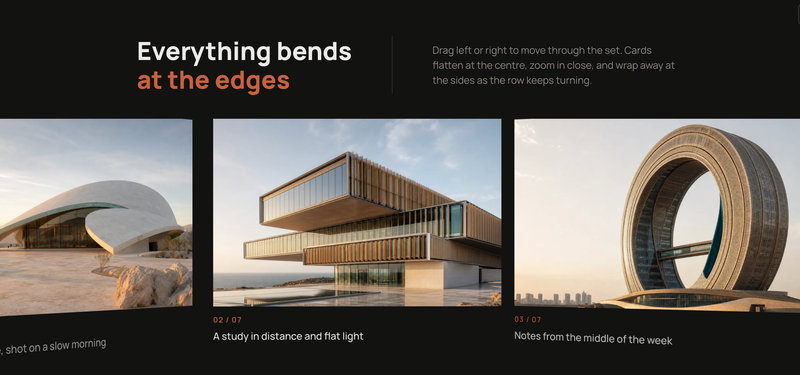
A hero section pairing a split editorial header with an endless CSS 3D carousel, no WebGL: cards tilt continuously with distance from the centre so the row reads as one arc, images counter-zoom inside their frames, and one velocity loop drives drift, drag, wheel, and keyboard input. Fully configurable via typed props.
A fixed frame masks a drifting photo deck. Drag it and panels hinge into 3D at the edge.
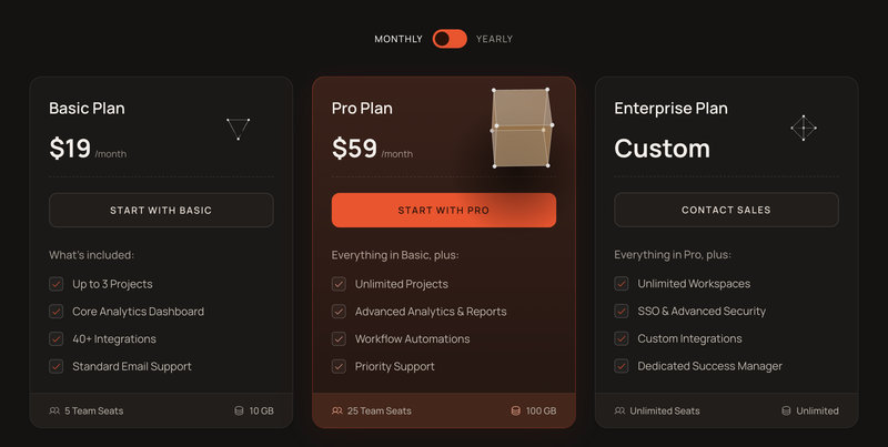
Three pricing cards, each topped by a still faceted gem that grows and spins on hover.
A draggable card deck you flick through one card at a time. The top card leans toward your drag, then spins away with momentum to reveal the next, and the deck loops endlessly. Every card pairs a picture with a title and a pill action button with hover and press states.
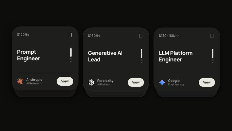
Three AI job card stacks with swipe-to-cycle. Brand logos, bookmark toggle, springs.
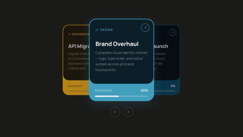
A swipeable project task card stack where each card has a unique accent colour, status badge, and due date. Drag left or right to cycle through tasks — springs back the dismissed card to the bottom of the deck.
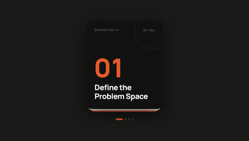
Swipeable card deck with four editorial slides. Navigate forward and back by drag or tap.
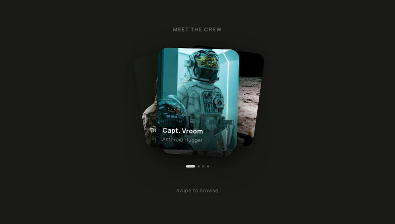
A swipeable portrait card stack perfect for introducing a team, showcasing crew members, or picking an avatar. Four stacked cards fan out with soft rotations — drag to browse, tap to choose. Drop in your own photos and names for an About Us section, a character selector, or an onboarding profile picker.
A swipeable deck of destination cards. Drag the front card down to fling it off-screen and reveal the next. Each card reveals an animated hotels counter as it comes forward.