Pill Toggle
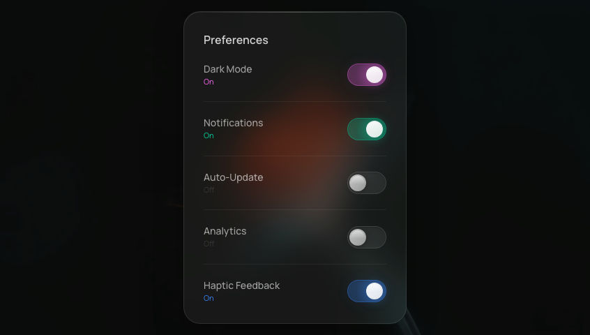
A minimal iOS-style slider toggle: thumb glides between off (grey) and on (green) with a snappy spring.
Add to your project
One command adds this component to your project.
Run the following command. New project? Run npx shadcn@latest init first to set up Tailwind and path aliases.
npx shadcn@latest add @aicanvas/pill-toggleFree account required. Signed out, this installs a placeholder file instead of the component.
For dark mode, add the dark class to your <html> element:
<html class="dark">Install with AI Canvas MCP
With AI Canvas MCP, your AI knows every component we ship. Ask for one inside Claude Code, Codex, or Cursor and it installs the component you pick. Works with any AI Canvas account, free or premium.
About Pill Toggle
Pill Toggle is the canonical iOS-style switch: a rounded track and a sliding thumb that snaps between grey (off) and green (on). The thumb travel is driven by Motion with a snappy spring, so the interaction feels immediate without overshooting. The whole component is keyboard and screen-reader friendly and adapts cleanly to dark mode through Tailwind tokens. Reach for it any time you would have used a checkbox for a binary on/off preference: settings panels, forms, dashboard rows, and inline feature flags.
Built with
Frequently asked questions
- Is Pill Toggle free to use?
- Yes. Pill Toggle is part of the free AI Canvas library and is open source under the MIT license, so you can use it in personal and commercial projects.
- How do I install Pill Toggle?
- One command: npx shadcn@latest add https://aicanvas.me/r/pill-toggle.json, free with a free AI Canvas account. Or connect the AI Canvas MCP server and ask your AI editor to install Pill Toggle for you. You can also copy the source straight from the Code tab, no account needed. It works in any React project with Tailwind CSS.
- What is Pill Toggle built with?
- Pill Toggle is built with React and TypeScript, using Motion and Tailwind CSS. It ships with both light and dark styling.
- Where would I use Pill Toggle?
- Common uses include Settings, Forms, and Dashboard. Like every AI Canvas component, it is self-contained and drops into any React project.
- Can I remix Pill Toggle with AI?
- Yes. Pill Toggle ships with one comprehensive AI prompt written against the real source code. Open "Remix with AI" on this page to read and copy it into Claude, Cursor, ChatGPT, or any AI tool. Prompts are for remixing your own variation; for the exact component, install it with the one-command CLI.


 AI Canvas