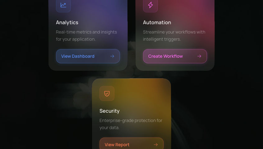
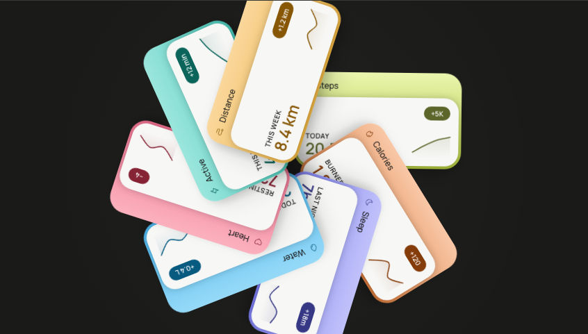
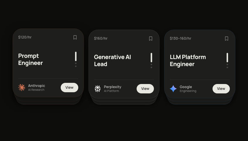
Glass ModalCentered dialog with deep glass blur, scale-spring entrance, and staggered content reveal.
Cards & ModalsGlassInteractive
Dark mode only
Refresh
Full screen
.png?updatedAt=1775223702866)
Upgrade to Pro
Unlock premium components, priority support, and early access to new features.
Unlimited components
Source code access
Priority support
'use client'
// npm install @phosphor-icons/react framer-motion
import { motion } from 'framer-motion'
import { X, Check, ShieldCheck } from '@phosphor-icons/react'
export default function GlassModal() {
return (
<div className="relative flex min-h-screen w-full items-center justify-center overflow-hidden bg-[#1A1A19]">
{/* Background image */}
<img
src="https://ik.imagekit.io/aitoolkit/bg%20images/Ethereal%20Orange%20Flower%201%20(1).png?updatedAt=1775223702866"
alt=""
className="pointer-events-none absolute inset-0 h-full w-full object-cover opacity-60"
/>
{/* Modal card */}
<motion.div
initial={{ scale: 0.9, y: 16 }}
animate={{ scale: 1, y: 0 }}
transition={{ type: 'spring', stiffness: 350, damping: 28 }}
className="relative isolate w-[340px] overflow-hidden rounded-3xl"
style={{
background: 'rgba(255, 255, 255, 0.08)',
border: '1px solid rgba(255, 255, 255, 0.12)',
boxShadow: '0 24px 80px rgba(0,0,0,0.5), 0 0 0 1px rgba(255,255,255,0.05), inset 0 1px 0 rgba(255,255,255,0.1)',
}}
>
{/* Blur layer — non-animating, isolated from entrance spring */}
<div
className="pointer-events-none absolute inset-0 z-[-1] rounded-3xl"
style={{ backdropFilter: 'blur(40px) saturate(1.8)', WebkitBackdropFilter: 'blur(40px) saturate(1.8)' }}
/>
{/* Top edge highlight */}
<div
className="absolute left-8 right-8 top-0 h-[1px]"
style={{ background: 'linear-gradient(90deg, transparent, rgba(255,255,255,0.25), transparent)' }}
/>
{/* Close button */}
<motion.button
whileHover={{ scale: 1.15, rotate: 90 }}
whileTap={{ scale: 0.9 }}
transition={{ duration: 0.2, ease: [0.25, 0.1, 0.25, 1] }}
className="absolute right-4 top-4 z-10 flex h-8 w-8 cursor-pointer items-center justify-center rounded-full"
style={{ background: 'rgba(255,255,255,0.08)', border: '1px solid rgba(255,255,255,0.08)' }}
>
<X size={14} weight="regular" className="text-white/60" />
</motion.button>
{/* Content */}
<div className="flex flex-col items-center px-8 pb-8 pt-10">
{/* Icon — notification-style tinted badge */}
<motion.div
initial={{ scale: 0, rotate: -20 }}
animate={{ scale: 1, rotate: 0 }}
transition={{ type: 'spring', stiffness: 300, damping: 18, delay: 0.15 }}
className="mb-5 flex h-16 w-16 items-center justify-center rounded-xl"
style={{
background: '#FFA03218',
border: '1px solid #FFA03222',
}}
>
<ShieldCheck size={28} weight="regular" style={{ color: '#FFA032' }} />
</motion.div>
<motion.h2
initial={{ opacity: 0, y: 8 }}
animate={{ opacity: 1, y: 0 }}
transition={{ delay: 0.2 }}
className="mb-2 text-lg font-semibold text-white/90"
>
Upgrade to Pro
</motion.h2>
<motion.p
initial={{ opacity: 0, y: 8 }}
animate={{ opacity: 1, y: 0 }}
transition={{ delay: 0.25 }}
className="mb-6 text-center text-sm leading-relaxed text-white/40"
>
Unlock premium components, priority support, and early access to new features.
</motion.p>
{/* Features */}
<motion.div
initial={{ opacity: 0 }}
animate={{ opacity: 1 }}
transition={{ delay: 0.3 }}
className="mb-6 flex w-full flex-col gap-3"
>
{['Unlimited components', 'Source code access', 'Priority support'].map((feature, i) => (
<motion.div
key={feature}
initial={{ opacity: 0, x: -12 }}
animate={{ opacity: 1, x: 0 }}
transition={{ delay: 0.35 + i * 0.08 }}
className="flex items-center gap-3"
>
<div
className="flex h-5 w-5 items-center justify-center rounded-full"
style={{ background: 'rgba(255, 155, 50, 0.18)' }}
>
<Check size={10} weight="regular" style={{ color: 'rgba(255, 155, 50, 1)' }} />
</div>
<span className="text-sm text-white/60">{feature}</span>
</motion.div>
))}
</motion.div>
{/* CTA buttons */}
<div className="flex w-full flex-col gap-2">
<motion.button
whileHover={{
scale: 1.04,
background: 'linear-gradient(135deg, rgba(255, 180, 80, 0.9), rgba(235, 75, 45, 0.8))',
boxShadow: '0 4px 24px rgba(220, 80, 30, 0.6)',
}}
whileTap={{ scale: 0.96 }}
transition={{ duration: 0.25, ease: [0.25, 0.1, 0.25, 1] }}
className="w-full cursor-pointer rounded-full py-3 text-sm font-semibold text-white"
style={{
background: 'linear-gradient(135deg, rgba(255, 160, 50, 0.75), rgba(220, 60, 40, 0.6))',
border: '1px solid rgba(255, 180, 80, 0.25)',
boxShadow: '0 2px 16px rgba(220, 80, 30, 0.4)',
}}
>
Upgrade Now
</motion.button>
<motion.button
whileHover={{ scale: 1.04, background: 'rgba(255,255,255,0.1)' }}
whileTap={{ scale: 0.96 }}
transition={{ duration: 0.25, ease: [0.25, 0.1, 0.25, 1] }}
className="w-full cursor-pointer rounded-full py-3 text-sm font-medium text-white/50"
style={{
background: 'rgba(255, 255, 255, 0.06)',
border: '1px solid rgba(255, 255, 255, 0.1)',
}}
>
Maybe Later
</motion.button>
</div>
</div>
</motion.div>
</div>
)
}
Add to your project
One command adds this component to your project.
1
Run the following command. New project? Run npx shadcn@latest init first to set up Tailwind and path aliases.
npx shadcn@latest add @aicanvas/glass-modal2
For dark mode, add the dark class to your <html> element:
<html class="dark">