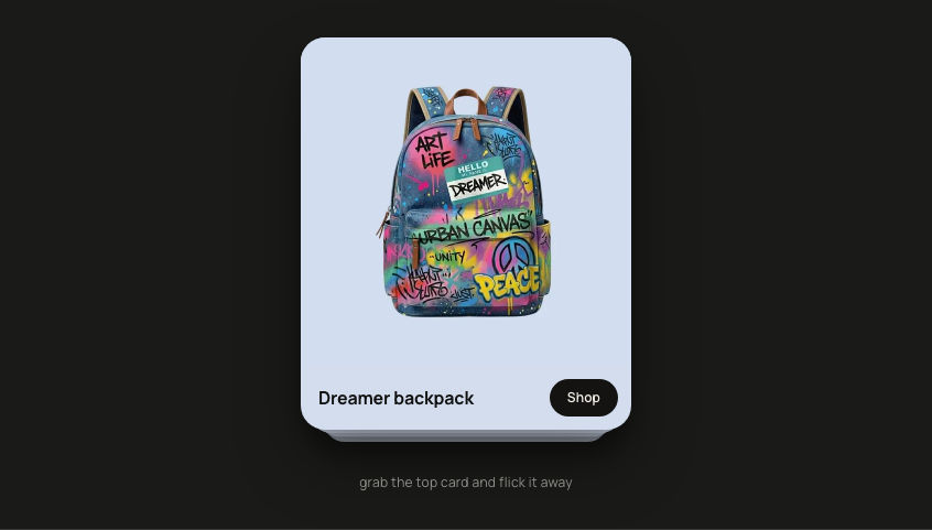
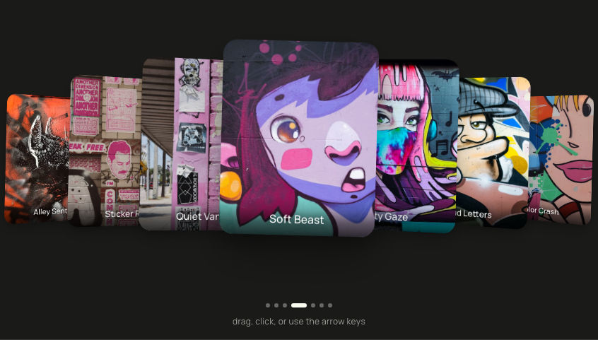
Interactive Card StackA scattered stack of photo cards.
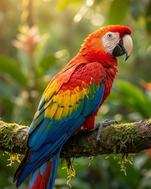
Scarlet macaw
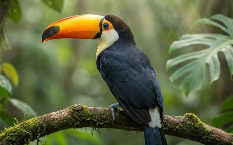
Toco toucan
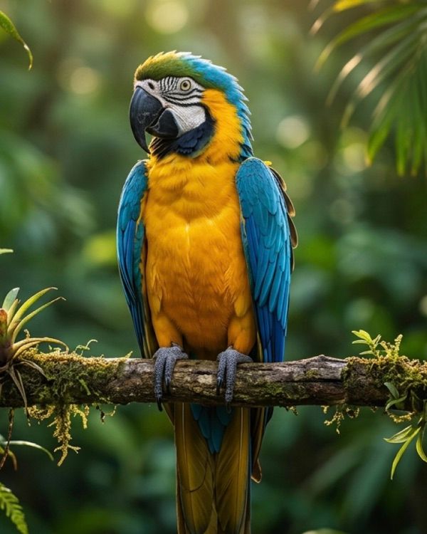
Blue and gold macaw
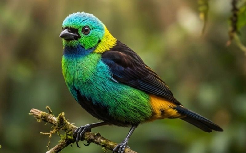
Green-headed tanager
Northern mockingbird
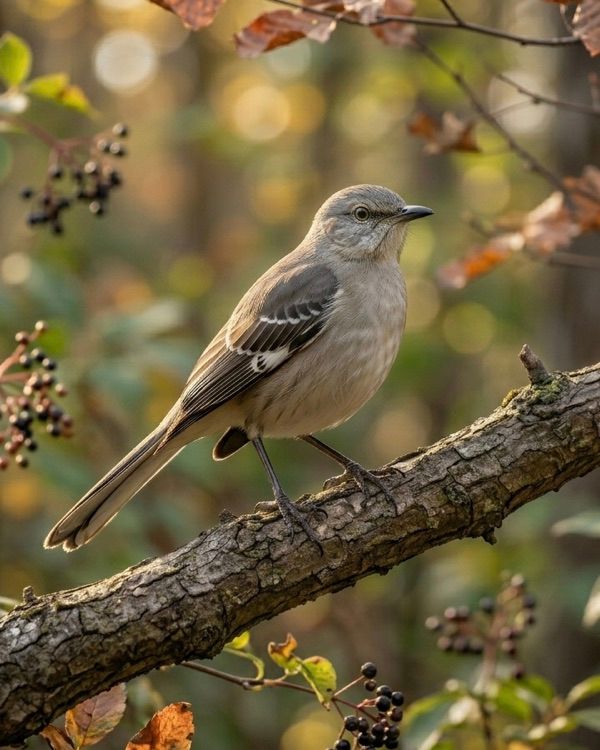
Scarlet macaw in focus
drag, click, or use the arrow keys
'use client'

// npm install framer-motion

import { useCallback, useEffect, useRef, useState, type CSSProperties } from 'react'
import { motion, useReducedMotion, type PanInfo } from 'framer-motion'

// ─── Types ────────────────────────────────────────────────────────────────────

interface Card {
  id: number
  orientation: 'portrait' | 'landscape'
  title?: string
  image: string
  // Optional. Set this to turn the top-right chip into a real link (opens in a
  // new tab). Left unset on every demo card below, so the chip is a decorative
  // affordance with no action. This is the seam for embedding your own links.
  href?: string
}

interface Slot {
  x: number
  y: number
  rotate: number
  scale: number
  zIndex: number
}

// ─── Data ─────────────────────────────────────────────────────────────────────
// Five tropical and woodland birds. Each photo is pre-cropped to its card
// aspect (portrait 4:5, landscape 16:10) so the CDN delivers a tight crop with
// no layout shift. Every card carries a short title strip above the image; the
// title is also the card's accessible name. Photos are decorative here (the
// visible title names them), so the <img> alt is empty.

const CARDS: Card[] = [
  {
    id: 0,
    orientation: 'portrait',
    title: 'Scarlet macaw',
    image: 'https://ik.imagekit.io/aitoolkit/interactive-card-stack/scarlet-macaw-rainforest-branch.jpg',
  },
  {
    id: 1,
    orientation: 'landscape',
    title: 'Toco toucan',
    image: 'https://ik.imagekit.io/aitoolkit/interactive-card-stack/toco-toucan-rainforest-canopy.jpg',
  },
  {
    id: 2,
    orientation: 'portrait',
    title: 'Blue and gold macaw',
    image: 'https://ik.imagekit.io/aitoolkit/interactive-card-stack/blue-and-gold-macaw-jungle-perch.jpg',
  },
  {
    id: 3,
    orientation: 'landscape',
    title: 'Green-headed tanager',
    image: 'https://ik.imagekit.io/aitoolkit/interactive-card-stack/green-headed-tanager-mossy-branch.jpg',
  },
  {
    id: 4,
    orientation: 'portrait',
    title: 'Northern mockingbird',
    image: 'https://ik.imagekit.io/aitoolkit/interactive-card-stack/northern-mockingbird-autumn-woodland.jpg',
  },
]

// ─── Slot tables ──────────────────────────────────────────────────────────────
// Slot 0 is the focused front card. Slots 1-4 scatter behind it. The mobile
// table tightens the spread so all 5 cards remain visible at narrow widths.

const SLOTS_DESKTOP: Slot[] = [
  { x:    0, y:   0, rotate:  1.5, scale: 1.00, zIndex: 50 },
  { x:  160, y: -30, rotate:  12,  scale: 0.90, zIndex: 40 },
  { x: -150, y: -10, rotate: -14,  scale: 0.89, zIndex: 30 },
  { x:   90, y:  70, rotate:  8,   scale: 0.86, zIndex: 20 },
  { x: -110, y:  60, rotate: -9,   scale: 0.84, zIndex: 10 },
]

const SLOTS_MOBILE: Slot[] = [
  { x:   0, y:   0, rotate:  1,   scale: 1.00, zIndex: 50 },
  { x:  90, y: -15, rotate:  6,   scale: 0.92, zIndex: 40 },
  { x: -85, y:  20, rotate: -7,   scale: 0.91, zIndex: 30 },
  { x:  55, y:  35, rotate:  4,   scale: 0.88, zIndex: 20 },
  { x: -55, y:  25, rotate: -4.5, scale: 0.87, zIndex: 10 },
]

// ─── Motion + chrome constants (hoisted so identities stay stable) ──────────────

const SPRING = { type: 'spring' as const, stiffness: 280, damping: 26 }
const MOUNT_SPRING = { type: 'spring' as const, stiffness: 200, damping: 22 }
const STAGGER_S = 0.08

const BREATH_Y_FOCUS = [0, -14, 0, 10, 0]
const BREATH_Y_REST = [0, -8, 0, 6, 0]
const BREATH_ROTATE_FOCUS = [0, 1.5, 0, -1.5, 0]
const BREATH_ROTATE_REST = [0, 1, 0, -1, 0]

const SHADOW_FOCUS = '0 24px 48px rgba(0,0,0,0.28), 0 6px 14px rgba(0,0,0,0.16)'
const SHADOW_REST = '0 12px 28px rgba(0,0,0,0.18), 0 4px 8px rgba(0,0,0,0.12)'

// Visible focus ring, matched to the olive accent.
const RING = 'focus-visible:outline-2 focus-visible:outline-offset-2 focus-visible:outline-[#A8B94D]'

const TITLE_STYLE: CSSProperties = {
  margin: 0,
  // Reserve room for the absolutely-positioned open button so the title never
  // reflows when the button appears on the focused card.
  paddingRight: 34,
  fontFamily: 'var(--font-sans, sans-serif)',
  fontWeight: 600,
  fontSize: '15px',
  lineHeight: 1.3,
  letterSpacing: '-0.01em',
  color: '#1a1a19',
  textAlign: 'left',
  display: '-webkit-box',
  WebkitLineClamp: 2,
  WebkitBoxOrient: 'vertical',
  overflow: 'hidden',
  minHeight: '2.6em',
}

const CHIP_POSITION: CSSProperties = { position: 'absolute', top: 10, right: 10, lineHeight: 0 }

const CHIP_STYLE: CSSProperties = {
  display: 'flex',
  alignItems: 'center',
  justifyContent: 'center',
  width: 'clamp(28px, 7.5vw, 36px)',
  height: 'clamp(28px, 7.5vw, 36px)',
  backgroundColor: '#141312',
  borderRadius: 11,
  boxShadow: '0 8px 18px rgba(0,0,0,0.42), 0 3px 6px rgba(0,0,0,0.30)',
}

// The dark chip with the open-arrow glyph, shared by the link and no-op variants.
const OpenChip = (
  <span style={CHIP_STYLE}>
    <svg
      width="56%"
      height="56%"
      viewBox="0 0 24 24"
      fill="none"
      stroke="#F5F1E8"
      strokeWidth={1}
      strokeLinecap="round"
      strokeLinejoin="round"
      aria-hidden
    >
      <path d="M7 17 L17 7" />
      <path d="M9 7 H17 V15" />
    </svg>
  </span>
)

// ─── InteractiveCardStack ───────────────────────────────────────────────────────

export default function InteractiveCardStack() {
  // order[slotIndex] = cardId. order[0] is always the focused front card.
  const [order, setOrder] = useState<number[]>([0, 1, 2, 3, 4])
  const [mounted, setMounted] = useState(false)
  const [isMobile, setIsMobile] = useState(false)

  // Scopes the arrow-key handler so it only fires when focus is inside the
  // widget, so the host page keeps its own arrow-key behaviour.
  const containerRef = useRef<HTMLDivElement | null>(null)
  // Separates a tap (< 8px) from a drag on the focused card.
  const dragDelta = useRef(0)

  const reduceMotion = useReducedMotion()

  useEffect(() => {
    setMounted(true)
  }, [])

  // Mobile breakpoint: flip slot table below 640px.
  useEffect(() => {
    if (typeof window === 'undefined') return
    const mq = window.matchMedia('(min-width: 640px)')
    const apply = () => setIsMobile(!mq.matches)
    apply()
    mq.addEventListener('change', apply)
    return () => mq.removeEventListener('change', apply)
  }, [])

  // Bring a card to slot 0. The rest of the order rotates so the previous
  // trailing cards keep their relative order behind it.
  const focusCard = useCallback((cardId: number) => {
    setOrder((prev) => {
      const idx = prev.indexOf(cardId)
      if (idx <= 0) return prev
      return [cardId, ...prev.slice(0, idx), ...prev.slice(idx + 1)]
    })
  }, [])

  // Cycle focus by ±1 with wrap. +1 → next (front card moves to the back),
  // -1 → previous (back card comes to the front).
  const step = useCallback((dir: 1 | -1) => {
    setOrder((prev) =>
      dir === 1
        ? [...prev.slice(1), prev[0]]
        : [prev[prev.length - 1], ...prev.slice(0, prev.length - 1)],
    )
  }, [])

  // Arrow keys cycle focus, but ONLY while focus is inside the widget so the
  // page's own Left/Right behaviour (caret, scroll, native controls) is intact.
  useEffect(() => {
    const handler = (event: KeyboardEvent) => {
      if (event.key !== 'ArrowRight' && event.key !== 'ArrowLeft') return
      const root = containerRef.current
      if (!root || !root.contains(document.activeElement)) return
      event.preventDefault()
      step(event.key === 'ArrowRight' ? 1 : -1)
    }
    window.addEventListener('keydown', handler)
    return () => window.removeEventListener('keydown', handler)
  }, [step])

  const handleDragEnd = useCallback(
    (_: unknown, info: PanInfo) => {
      const distance = info.offset.x
      const velocity = info.velocity.x
      if (distance < -80 || velocity < -400) step(1)
      else if (distance > 80 || velocity > 400) step(-1)
    },
    [step],
  )

  const slots = isMobile ? SLOTS_MOBILE : SLOTS_DESKTOP
  const frontCardId = order[0]
  const frontTitle = CARDS.find((c) => c.id === frontCardId)?.title ?? ''

  return (
    <div className="flex min-h-screen w-full items-center justify-center bg-[#E8E8DF] px-4 dark:bg-[#1A1A19]">
      <div ref={containerRef} className="relative flex w-full max-w-4xl flex-col items-center gap-10 py-12">
        {/* Stage: overflow-hidden so the scattered, rotated cards never spill
            past the container and trigger a horizontal page scrollbar. */}
        <div
          role="group"
          aria-label="Interactive card stack"
          aria-describedby="ics-hint"
          className="relative flex w-full select-none items-center justify-center overflow-hidden"
          style={{ perspective: '1400px', height: 'clamp(320px, 44vw, 440px)' }}
        >
          {CARDS.map((card) => {
            const slotIndex = order.indexOf(card.id)
            const slot = slots[slotIndex]
            const isFocus = slotIndex === 0
            const isLandscape = card.orientation === 'landscape'

            // Entrance stagger (outer cards land first, focus lands last);
            // skipped entirely under reduced motion.
            const transition =
              !reduceMotion && !mounted
                ? { ...MOUNT_SPRING, delay: slotIndex * STAGGER_S }
                : SPRING

            const widthClass = isLandscape
              ? isMobile
                ? 'w-[clamp(200px,60vw,260px)]'
                : 'w-[clamp(220px,28vw,320px)]'
              : isMobile
                ? 'w-[clamp(130px,42vw,180px)]'
                : 'w-[clamp(160px,20vw,220px)]'

            // Breathing is suppressed for reduced-motion users.
            const breathY = reduceMotion ? 0 : isFocus ? BREATH_Y_FOCUS : BREATH_Y_REST
            const breathRotate = reduceMotion
              ? 0
              : isFocus
                ? BREATH_ROTATE_FOCUS
                : BREATH_ROTATE_REST

            return (
              <motion.div
                key={card.id}
                tabIndex={0}
                // Only back cards are activatable controls. The focused card has
                // no action (it is dragged, not clicked), so it is not a button.
                role={isFocus ? undefined : 'button'}
                aria-label={
                  isFocus
                    ? `${card.title ?? 'Card'}, current. Drag or use the arrow keys to change cards.`
                    : `Show ${card.title ?? `card ${card.id + 1}`}`
                }
                onClick={
                  isFocus
                    ? undefined
                    : (event) => {
                        event.preventDefault()
                        if (Math.abs(dragDelta.current) >= 8) return
                        focusCard(card.id)
                      }
                }
                onKeyDown={
                  isFocus
                    ? undefined
                    : (event) => {
                        if (event.key === 'Enter' || event.key === ' ') {
                          event.preventDefault()
                          focusCard(card.id)
                        }
                      }
                }
                onPointerDown={() => {
                  dragDelta.current = 0
                }}
                drag={isFocus ? 'x' : false}
                dragConstraints={{ left: 0, right: 0 }}
                dragElastic={0.6}
                onDrag={(_, info) => {
                  dragDelta.current = info.offset.x
                }}
                onDragEnd={handleDragEnd}
                className={`absolute ${widthClass} rounded-[18px] outline-none ${isFocus ? '' : RING}`}
                // z-index follows the slot, so a flicked card drops behind the
                // others the instant it is released and slides under them as it
                // travels to the rear (no late, visible z-index swap).
                style={{ cursor: isFocus ? 'grab' : 'pointer', zIndex: slot.zIndex }}
                initial={reduceMotion ? false : { opacity: 0, scale: 0.5, y: 60 }}
                animate={{ x: slot.x, y: slot.y, rotate: slot.rotate, scale: slot.scale, opacity: 1 }}
                transition={transition}
                whileTap={isFocus ? { cursor: 'grabbing' } : undefined}
              >
                {/* Middle layer owns the breathing loop AND the polaroid
                    chrome, so frame, shadow, title, and image move as one unit. */}
                <motion.div
                  className="relative flex w-full flex-col rounded-[18px] ring-1 ring-black/[0.08] dark:ring-white/[0.12]"
                  style={{ backgroundColor: '#FFFFFF', padding: '10px', boxShadow: isFocus ? SHADOW_FOCUS : SHADOW_REST }}
                  animate={{ y: breathY, rotate: breathRotate }}
                  transition={
                    reduceMotion
                      ? { duration: 0 }
                      : { duration: 7 + card.id * 0.6, repeat: Infinity, ease: 'easeInOut' }
                  }
                >
                  {/* Dark-mode paper colour overlay, pinned inside the frame. */}
                  <span
                    aria-hidden
                    className="pointer-events-none absolute inset-0 rounded-[18px] dark:bg-[#F5F5F0]"
                  />

                  {card.title && (
                    <div style={{ position: 'relative', padding: '14px 12px 8px 12px' }}>
                      <p style={TITLE_STYLE}>{card.title}</p>

                      {/* Top-right chip, rendered ONLY on the focused card (so
                          there are never hidden, focusable controls behind the
                          front). When card.href is set it is a real link that
                          opens in a new tab; otherwise it is a decorative
                          affordance with no action, hidden from assistive tech.
                          Set href per card to wire your own link. */}
                      {isFocus &&
                        (card.href ? (
                          <motion.a
                            href={card.href}
                            target="_blank"
                            rel="noopener noreferrer"
                            aria-label={`Open ${card.title ?? 'item'} in a new tab`}
                            onPointerDown={(event) => event.stopPropagation()}
                            onClick={(event) => event.stopPropagation()}
                            className={`rounded-[11px] outline-none ${RING}`}
                            style={CHIP_POSITION}
                            initial={{ opacity: 0, scale: 0.85 }}
                            animate={{ opacity: 1, scale: 1 }}
                            transition={SPRING}
                            whileHover={{ scale: 1.1 }}
                            whileTap={{ scale: 0.9 }}
                          >
                            {OpenChip}
                          </motion.a>
                        ) : (
                          <motion.span
                            aria-hidden
                            onPointerDown={(event) => event.stopPropagation()}
                            style={CHIP_POSITION}
                            initial={{ opacity: 0, scale: 0.85 }}
                            animate={{ opacity: 1, scale: 1 }}
                            transition={SPRING}
                            whileHover={{ scale: 1.1 }}
                            whileTap={{ scale: 0.9 }}
                          >
                            {OpenChip}
                          </motion.span>
                        ))}
                    </div>
                  )}

                  {/* Image well: rounded, clipped, aspect-locked. The focused
                      image loads eagerly at high priority (it is the LCP hero);
                      the rest defer. */}
                  <div
                    className={`relative w-full overflow-hidden ${isLandscape ? 'aspect-[16/10]' : 'aspect-[4/5]'}`}
                    style={{ borderRadius: 10 }}
                  >
                    <img
                      src={card.image}
                      alt=""
                      loading={isFocus ? 'eager' : 'lazy'}
                      fetchPriority={isFocus ? 'high' : 'low'}
                      draggable={false}
                      className="absolute inset-0 h-full w-full object-cover"
                    />
                  </div>
                </motion.div>
              </motion.div>
            )
          })}
        </div>

        {/* Announce the front-card change to assistive tech. */}
        <p className="sr-only" aria-live="polite">
          {frontTitle ? `${frontTitle} in focus` : ''}
        </p>

        {/* Dot indicator + hint */}
        <div className="flex flex-col items-center gap-3">
          <div className="flex items-center gap-1.5">
            {CARDS.map((card) => {
              const isCurrent = frontCardId === card.id
              return (
                <button
                  key={card.id}
                  type="button"
                  aria-label={`Show ${card.title ?? `card ${card.id + 1}`}`}
                  aria-current={isCurrent ? true : undefined}
                  onClick={() => focusCard(card.id)}
                  // 24px hit box (WCAG 2.5.8) around the small visible pill.
                  className={`flex items-center justify-center rounded-full outline-none ${RING}`}
                  style={{ width: 24, height: 24 }}
                >
                  <motion.span
                    className="block rounded-full bg-[#21211F] dark:bg-[#FAFAF0]"
                    animate={{ width: isCurrent ? 20 : 5, opacity: isCurrent ? 1 : 0.3 }}
                    transition={{ type: 'spring', stiffness: 400, damping: 30 }}
                    style={{ height: 5 }}
                  />
                </button>
              )
            })}
          </div>
          <p id="ics-hint" className="text-sm tracking-wide text-[#666662] dark:text-[#9E9E98]">
            drag, click, or use the arrow keys
          </p>
        </div>
      </div>
    </div>
  )
}
Add to your project
One command adds this component to your project.
Run the following command. New project? Run npx shadcn@latest init first to set up Tailwind and path aliases.
npx shadcn@latest add @aicanvas/interactive-card-stackFor dark mode, add the dark class to your <html> element:
<html class="dark">Install with AI Canvas MCP
With AI Canvas MCP, your AI knows every component we ship. Ask for “a navigation component from AI Canvas” inside Claude Code, Codex, or Cursor and it can suggest you a few options, then install the one you like. Less typing, lower token cost, modern way to build.
Get MCPAbout Interactive Card Stack
Interactive Card Stack is a loose pile of five photo cards scattered around a focused center, each a polaroid-style print that breathes gently on its own slow loop. Click any card to pull it to the front, drag the front card sideways to cycle, or use the arrow keys, and the rest spring into a new arrangement around it. Motion drives the scatter, the breathing, and the focus shuffle; Tailwind covers the layout, and it honours reduced-motion settings. Drop in your own photos and titles, and set an optional link per card. It suits image galleries, moodboards, and portfolio sections where the photo itself is the point.
 AI Canvas