Components/Cards & Modals

Animated React Cards and Modals

Animated card and modal dialog components for React. Built with Tailwind CSS and Motion, ready to copy and paste or install via the shadcn CLI.
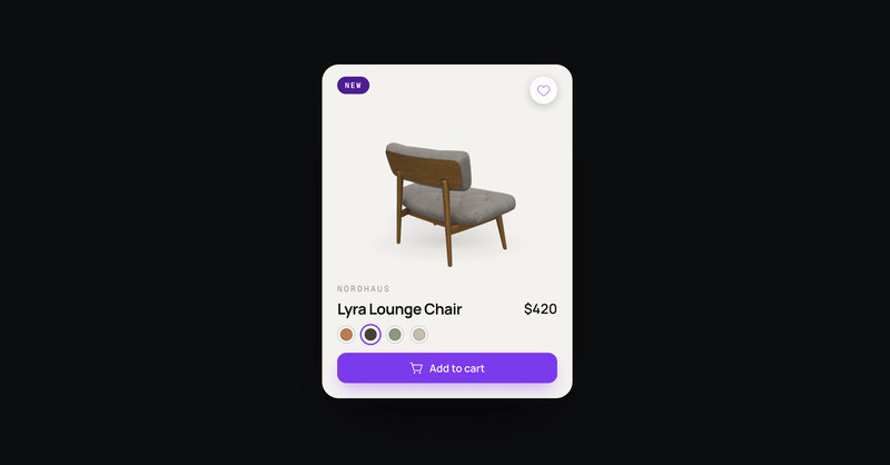
Free component
Mood Tracker

Mood Tracker

A feelings check-in card with six expressive faces. Drag the segmented slider and the face, label, and liquid color wash shift with your mood.

View Component
Free component
Product Card Deck

Product Card Deck

A draggable card deck you flick through one card at a time. The top card leans toward your drag, then spins away with momentum to reveal the next, and the deck loops endlessly. Every card pairs a picture with a title and a pill action button with hover and press states.

View Component
Free component
Interactive Card Stack

Interactive Card Stack

A scattered stack of photo cards. Drag, click, or arrow keys to focus any card.

View Component
Free component
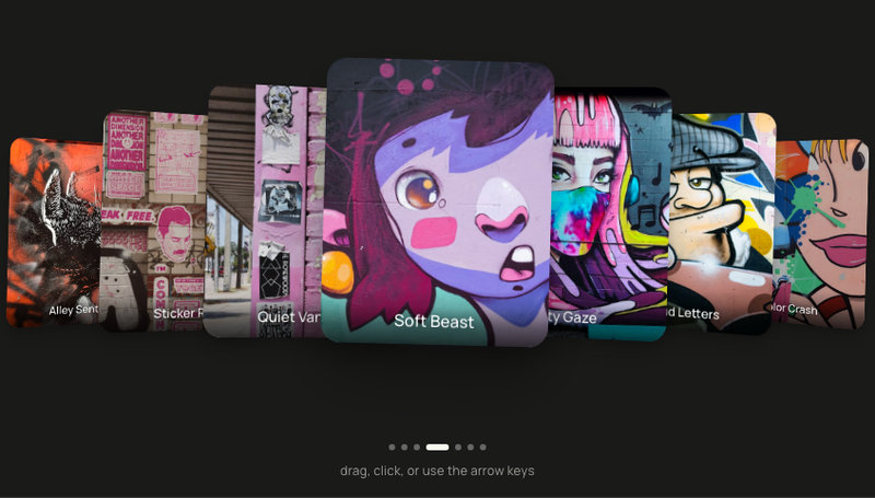
Tilted Coverflow

Tilted Coverflow

3D coverflow card carousel of seven tilted photos. Drag or arrows to focus any card.

View Component
Free component
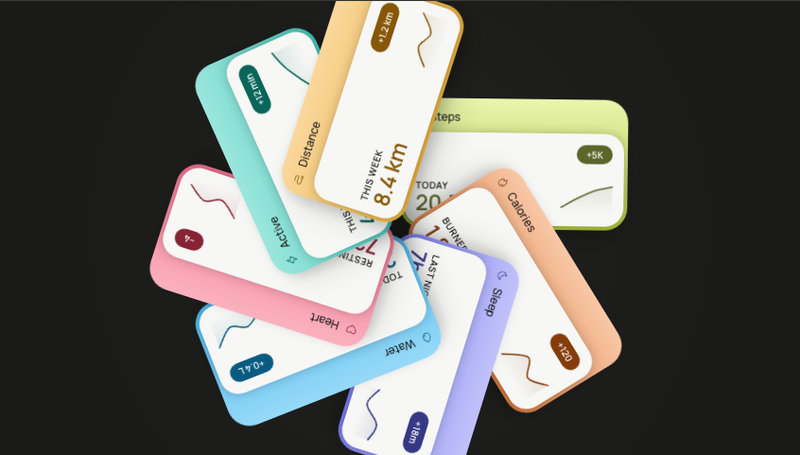
Radial Cards

Radial Cards

Seven health-metric cards bloom into a slowly rotating flower — tap any petal to pull it forward and read your stats up close.

View Component
Free component
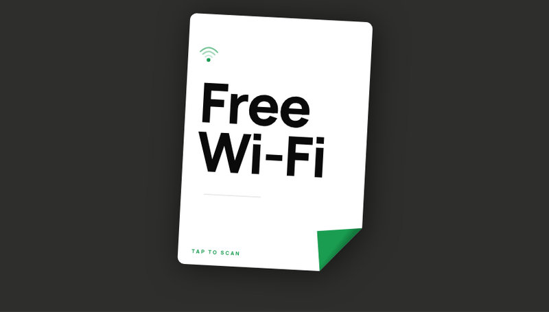
Peel to Scan

Peel to Scan

A portrait card whose corner peels on tap, revealing a scannable Wi-Fi QR code.

View Component
Free component
AI Job Cards

AI Job Cards

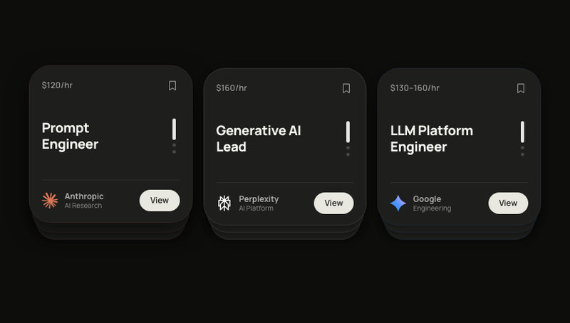
Three AI job card stacks with swipe-to-cycle. Brand logos, bookmark toggle, springs.

View Component
Free component
Label Cards

Label Cards

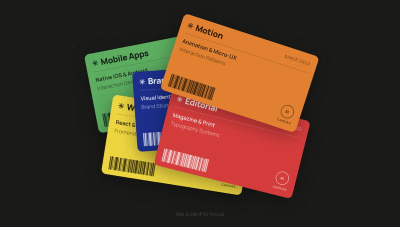
Colour-blocked label cards scattered at random angles. Tap one to spring it to centre.

View Component
Free component
Slide Deck

Slide Deck

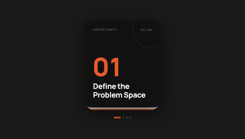
Swipeable card deck with four editorial slides. Navigate forward and back by drag or tap.

View Component
Free component
Task Cards

Task Cards

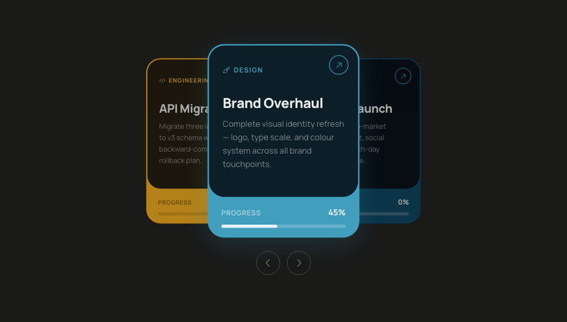
A swipeable project task card stack where each card has a unique accent colour, status badge, and due date. Drag left or right to cycle through tasks — springs back the dismissed card to the bottom of the deck.

View Component
Free component
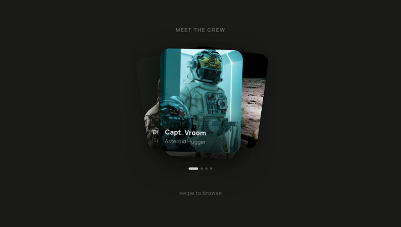
Meet the Crew

Meet the Crew

A swipeable portrait card stack perfect for introducing a team, showcasing crew members, or picking an avatar. Four stacked cards fan out with soft rotations — drag to browse, tap to choose. Drop in your own photos and names for an About Us section, a character selector, or an onboarding profile picker.

View Component
Free component
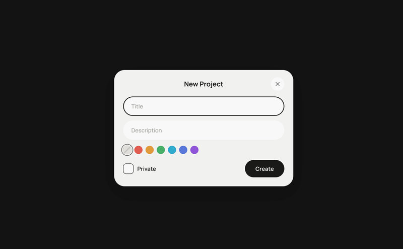
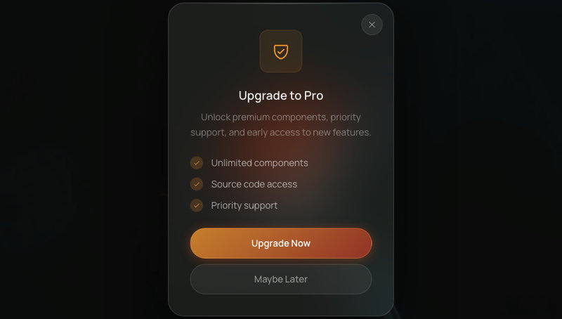
Glass Modal

Glass Modal

Centered dialog with deep glass blur, scale-spring entrance, and staggered content reveal.

View Component
Free component
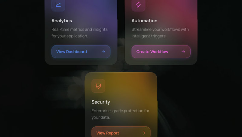
Glass Card

Glass Card

Glassmorphism content cards with 3D tilt-on-hover, spring physics, and a cursor-following glare highlight.

View Component
Free component
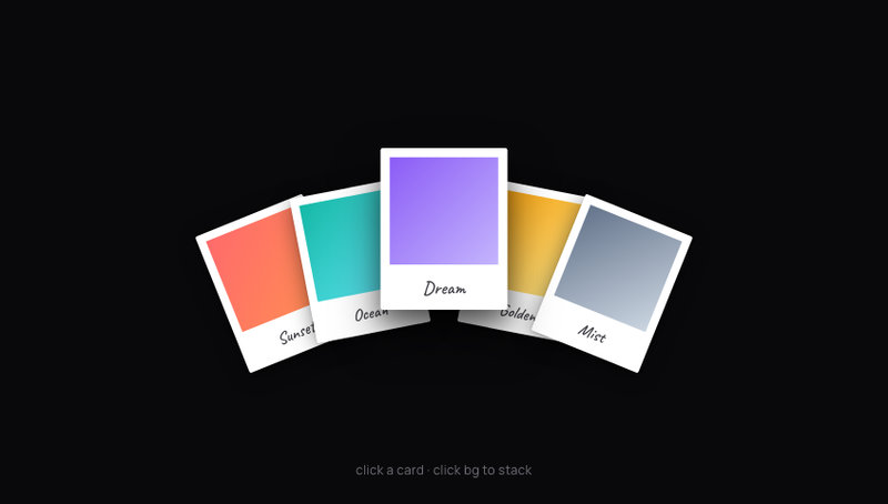
Polaroid Stack

Polaroid Stack

Five polaroid photo cards stacked in a casual pile — click to fan them out in a spring-animated arc, hover to lift, click a card to spotlight it.

View Component
Free component
Travel Deck

Travel Deck

A swipeable deck of destination cards. Drag the front card down to fling it off-screen and reveal the next. Each card reveals an animated hotels counter as it comes forward.

View Component