# CurvedFrameCarousel
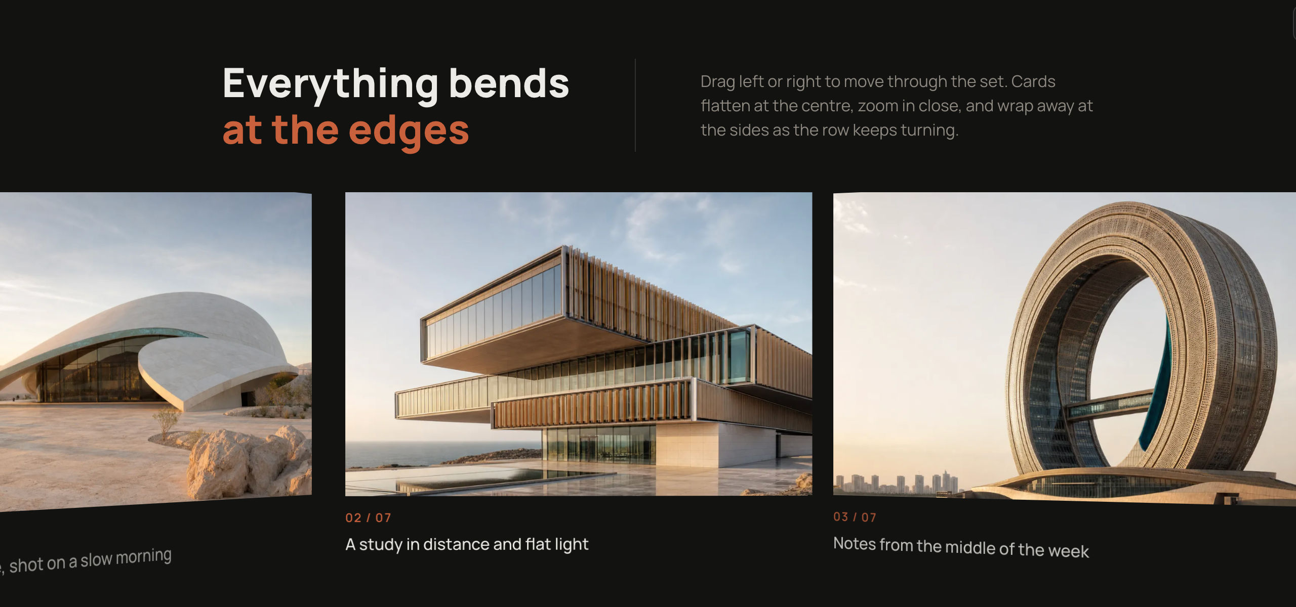
An endless track of photo panels sliding under one static, page-coloured SVG frame whose slot flares open toward both edges.

## 1. Setup
// npm install framer-motion
File: components-workspace/curved-frame-carousel/index.tsx  ·  'use client'  ·  export default function CurvedFrameCarousel({ items: itemsProp = DEFAULT_ITEMS, eyebrow = 'Portfolio', title = 'Things we made on purpose', subtitle = 'Made with intent and a stubborn sense of proportion. Classical bones, modern finish, nothing decorative.', hint = '', ctaPrimary = null, ctaSecondary = { label: 'Start a project' }, autoDrift = true, driftSpeed = 26, panelAspect = 2, edgeSlotRatio = 0.78, flareRatio = 0.28, flareTension = 0.72, edgeRotation = 24, onIndexChange, className }: CurvedFrameCarouselProps)

import { useEffect, useLayoutEffect, useMemo, useRef, useState } from 'react'
import {
  motion,
  useMotionValue,
  useTransform,
  wrap,
  type MotionValue,
  type PanInfo,
} from 'framer-motion'

## 2. Constants

const useIsoLayoutEffect = typeof window !== 'undefined' ? useLayoutEffect : useEffect

export type CurvedFrameItem = {
  /** Image URL for the panel. */
  src: string
  /** Alternative text for the image. */
  alt: string
  /** Caption shown in the readout row while this panel is nearest the slot centre. */
  caption: string
  /**
   * Vertical focal point of the image, 0 being its top edge and 1 its bottom.
   * The block lines this point up with the middle of the visible slot, so set it
   * to wherever the subject is. Defaults to 0.34, the upper third.
   */
  focus?: number
}

export type CurvedFrameAction = {
  /** Text on the button. */
  label: string
  /** Destination; when present the action renders as a link. */
  href?: string
  /** Handler; used when no href is given. */
  onClick?: () => void
}

// ASSET, described instead of pasted. The shipped defaults route every src
// through one helper:
//   const img = (n: string) => `<your image host>/curved-frame-${n}.png?tr=w-1200,q-80,f-auto`
// Five distinct landscape plates, originally PNG, delivered around 1200px wide.
// The transform query is doing real work: w-1200 covers a retina panel without
// shipping the full plate, q-80 is the quality, and f-auto hands WebP or AVIF to
// browsers that take it, which turns a 2.4MB source PNG into a few hundred KB.
// Role: the photographic content of every panel; the whole component is a frame
// over these. The originals are the author's own artwork on a private CDN, so
// point `img` at your own five landscape images, 1200px or wider, from
// unsplash.com or picsum.photos, and keep a width and format query on them.
// The subjects behind the shipped alt text and focus values:
//   01  colonnade above the cloud line
//   02b the bust and the low moon, night
//   03  the observatory, adrift
//   04b the courier at the foot of the stair
//   05b the same composition in daylight, on parchment

const DEFAULT_ITEMS: CurvedFrameItem[] = [
  {
    src: img('01'),
    focus: 0.42,
    alt: 'A vine-covered marble colonnade opening onto floating domes in cloud',
    caption: 'A doorway that opens onto nothing but weather',
  },
  {
    src: img('02b'),
    focus: 0.28,
    alt: 'A marble bust in profile against a deep orange moon, with coral peonies and a stair climbing to a floating domed temple',
    caption: 'The night the moon came in close',
  },
  {
    src: img('03'),
    focus: 0.34,
    alt: 'A domed observatory adrift in cloud, ringed by thin orbital diagrams',
    caption: 'The observatory keeps an orbit of its own',
  },
  {
    src: img('04b'),
    focus: 0.3,
    alt: 'A hooded figure with an olive visor seen from behind, facing a long stair that climbs to a floating domed palace',
    caption: 'He stops at the bottom of the stair',
  },
  {
    src: img('05b'),
    focus: 0.28,
    alt: 'A pale parchment study of the same marble bust, coral peonies and a stair to a floating domed temple',
    caption: 'The same climb, drawn from memory',
  },
]

const COAST_TAU = 0.55 // seconds for a released throw to settle back into the drift speed
const DRIFT_START = 150 // ms after mount
const DRIFT_RESUME = 250 // ms after the last interaction clears
const RAMP_IN = 0.3 // seconds to reach full drift speed
const RAMP_OUT = 0.26 // seconds to stop when interrupted
const BLEED = 0 // zero, and it must stay zero
const FOCUS_ZOOM = 1.4 // image height as a multiple of the panel, so focus can move it
const DEFAULT_FOCUS = 0.34 // upper third: where a subject's head usually sits
const ELL = 0.5523 // quarter ellipse, kept as the reference value for flareTension
const FLARE_MIN_ASPECT = 2.5 // flattest the flare may get, as run over travel
const OVERSHOOT = 2 // px the frame fill extends past the stage on every side
const LUT_PER_PITCH = 32 // LUT samples per pitch; the step must divide pitch exactly

const clamp = (v: number, lo: number, hi: number) => (v < lo ? lo : v > hi ? hi : v)
const clamp01 = (t: number) => (t < 0 ? 0 : t > 1 ? 1 : t)
const smooth = (t: number) => t * t * (3 - 2 * t)
const r2 = (v: number) => Math.round(v * 100) / 100

type Geo = {
  w: number
  stageH: number
  panelW: number
  boxW: number
  pitch: number
  nodeCount: number
  total: number
  restX: number
  insetTop: number
  insetBottom: number
  edgeInsetTop: number
  edgeInsetBottom: number
  flare: number
  headerMaxW: number
  persp: number
  maxRot: number
  flatHalf: number
  band: number
  lut: number[]
  lutStep: number
}

// 0 through the whole flat centre band, smoothstepped to 1 by the stage edge.
// `c` is a panel's signed centre offset from the stage centre.
const rampOf = (g: Geo, c: number) => smooth(clamp01((Math.abs(c) - g.flatHalf) / g.band))

// Screen position of a panel's inner (hinge) edge, given its NOMINAL inner-edge
// offset from the stage centre. Odd function, linear extrapolation past the LUT.
const mapX = (g: Geo, u: number) => {
  const s = u < 0 ? -1 : 1
  const a = Math.abs(u)
  const L = g.lut
  const last = L.length - 1
  const f = a / g.lutStep
  const i = Math.floor(f)
  if (i >= last) {
    const slope = (L[last] - L[last - 1]) / g.lutStep
    return s * (L[last] + (a - last * g.lutStep) * slope)
  }
  return s * (L[i] + (f - i) * (L[i + 1] - L[i]))
}

// Nudge the rest offset outward from 0 until both stage edges clear every panel
// divider by 24px, measured in SCREEN space so the foreshortening counts.
const pickRest = (g: Geo) => {
  const reach = Math.ceil(g.total / 2 / g.pitch)
  const clearance = (off: number) => {
    let m = Infinity
    for (let k = -reach; k <= reach; k++) {
      const j = off + g.pitch / 2 + k * g.pitch // nominal divider, also an inner edge
      if (Math.abs(j) > g.w / 2 + 2 * g.pitch) continue
      const s = mapX(g, j)
      m = Math.min(m, Math.abs(s - g.w / 2), Math.abs(s + g.w / 2))
    }
    return m
  }
  let best = 0
  let bestC = -1
  for (let i = 0; i <= 48; i++) {
    const off = (i % 2 ? -1 : 1) * Math.ceil(i / 2) * (g.pitch / 48)
    const c = clearance(off)
    if (c >= 24) return Math.round(off)
    if (c > bestC) {
      bestC = c
      best = off
    }
  }
  return Math.round(best)
}

function geometry(
  w: number,
  n: number,
  insetTop: number,
  insetBottom: number,
  panelAspect: number,
  edgeSlotRatio: number,
  flareRatio: number,
  edgeRotation: number,
): Geo {
  const panelW = Math.round(clamp(w * 0.42, 240, 720))
  const pitch = panelW // panels butt together, no divider
  const boxW = panelW + 2 * BLEED
  const flare = clamp(w * flareRatio, w * 0.1, Math.min(w * 0.32, 720))
  const flatRun = w - 2 * flare
  const headerMaxW = Math.max(Math.min(720, flatRun - 24), Math.min(w - 32, 200))

  const slotH = Math.round(panelW / clamp(panelAspect, 0.4, 6))
  const stageH = insetTop + slotH + insetBottom

  const edgeBand = Math.max(0, stageH * (1 - edgeSlotRatio))
  const sum = Math.max(1, insetTop + insetBottom)
  const maxTravel = flare / FLARE_MIN_ASPECT
  const edgeInsetTop = Math.max(
    Math.min(insetTop, (edgeBand * insetTop) / sum),
    insetTop - maxTravel,
  )
  const edgeInsetBottom = Math.max(
    Math.min(insetBottom, (edgeBand * insetBottom) / sum),
    insetBottom - maxTravel,
  )

  const flatHalf = Math.max(
    Math.min(w / 2 - flare + panelW * 0.3, w / 2 - panelW * 0.15),
    panelW * 0.55,
  )
  const band = Math.max(w / 2 - flatHalf, panelW * 0.22)
  const persp = w >= 1024 ? 1800 : 1400
  const maxRot = edgeRotation

  // the no-gap map, an exact recurrence sampled into a LUT:
  //   P(u) = (P(u - pitch) + pitch * cos a) * persp / (persp + pitch * sin a)
  const lutStep = pitch / LUT_PER_PITCH
  const nSamp = Math.ceil((w / 2 + 2.5 * pitch) / lutStep) + 1
  const rad = (maxRot * Math.PI) / 180
  const lut = new Array<number>(nSamp)
  for (let i = 0; i < nSamp; i++) {
    const u = i * lutStep
    if (i <= LUT_PER_PITCH) {
      lut[i] = u // seed: the centre-straddling panel is flat, so P(u) = u there
      continue
    }
    const a = rad * smooth(clamp01((Math.abs(u - pitch / 2) - flatHalf) / band))
    lut[i] = (lut[i - LUT_PER_PITCH] + pitch * Math.cos(a)) * (persp / (persp + pitch * Math.sin(a)))
  }

  const need = Math.max(n, Math.ceil((w + 4 * pitch) / pitch))
  const nodeCount = Math.ceil(need / n) * n

  const g: Geo = {
    w,
    stageH,
    panelW,
    boxW,
    pitch,
    nodeCount,
    total: pitch * nodeCount,
    restX: 0,
    insetTop,
    insetBottom,
    edgeInsetTop,
    edgeInsetBottom,
    flare,
    headerMaxW,
    persp,
    maxRot,
    flatHalf,
    band,
    lut,
    lutStep,
  }
  g.restX = pickRest(g)
  return g
}

// The hero. Outer rectangle plus one slot subpath, evenodd, so the slot is a hole.
function framePath(
  w: number,
  h: number,
  insetTop: number,
  insetBottom: number,
  edgeTop: number,
  edgeBottom: number,
  flare: number,
  tension: number,
) {
  const F = Math.min(flare, w / 2)
  const t = clamp(tension, 0.2, 0.95)
  const kh = r2(t * F) // horizontal handle, at the inner (straight-band) end
  const kvT = r2(t * Math.abs(insetTop - edgeTop)) // vertical handle, top edge
  const kvB = r2(t * Math.abs(insetBottom - edgeBottom)) // vertical handle, bottom edge
  const IT = r2(insetTop)
  const ET = r2(edgeTop)
  const IB = r2(h - insetBottom)
  const EB = r2(h - edgeBottom)
  const W = r2(w)
  const f = r2(F)
  const wf = r2(w - F)
  const wfk = r2(w - F + kh)
  const fk = r2(F - kh)
  const ETv = r2(edgeTop + kvT) // the top flare pulls down from the edge
  const EBv = r2(h - edgeBottom - kvB) // the bottom flare pulls up from the edge
  const O = OVERSHOOT
  return (
    `M ${-O} ${-O} H ${r2(w + O)} V ${r2(h + O)} H ${-O} Z ` +
    `M 0 ${ET} C 0 ${ETv}, ${fk} ${IT}, ${f} ${IT} ` +
    `H ${wf} ` +
    `C ${wfk} ${IT}, ${W} ${ETv}, ${W} ${ET} ` +
    `V ${EB} ` +
    `C ${W} ${EBv}, ${wfk} ${IB}, ${wf} ${IB} ` +
    `H ${f} ` +
    `C ${fk} ${IB}, 0 ${EBv}, 0 ${EB} Z`
  )
}

type CurvedFrameCarouselProps = {
  items?: CurvedFrameItem[]
  eyebrow?: string
  title?: string
  subtitle?: string
  hint?: string
  ctaPrimary?: CurvedFrameAction | null
  ctaSecondary?: CurvedFrameAction | null
  autoDrift?: boolean
  driftSpeed?: number
  panelAspect?: number
  edgeSlotRatio?: number
  flareRatio?: number
  flareTension?: number
  edgeRotation?: number
  onIndexChange?: (index: number, item: CurvedFrameItem) => void
  className?: string
}

/**
 * @typedef {object} CurvedFrameCarouselProps
 * @property {{src: string, alt: string, caption: string, focus?: number}[]} [items=DEFAULT_ITEMS] Panels on the endless track, in order; each needs an image URL, alt text and a caption, plus an optional focus from 0 to 1 marking where in the image the subject sits vertically.
 * @property {string} [eyebrow='Portfolio'] Small uppercase kicker above the title, also used as the carousel label for screen readers.
 * @property {string} [title='Things we made on purpose'] Heading shown inside the frame's top band.
 * @property {string} [subtitle='Made with intent and a stubborn sense of proportion. Classical bones, modern finish, nothing decorative.'] Supporting line under the title, hidden on stages narrower than 480px.
 * @property {string} [hint=''] Optional input hint under the readout row; empty by default, and hidden on stages narrower than 480px when set.
 * @property {{label: string, href?: string, onClick?: () => void}} [ctaPrimary=null] Optional filled call to action under the subtitle; renders a link when href is given and a button otherwise. Off by default.
 * @property {{label: string, href?: string, onClick?: () => void}} [ctaSecondary={label: 'Start a project'}] Outlined call to action. Sits beside ctaPrimary when both are set and is dropped on stages under 400px in that case; when it is the only action it always renders. Pass null for none.
 * @property {boolean} [autoDrift=true] Whether the track drifts on its own while idle.
 * @property {number} [driftSpeed=26] Idle drift speed in pixels per second.
 * @property {number} [panelAspect=2] Width divided by height of the panel crop visible in the middle of the frame; raise it for a wider, shorter centre band.
 * @property {number} [edgeSlotRatio=0.78] Visible slot height at each stage edge, as a fraction of stage height. Lower it for a shallower curve, raise it toward 1 for a deeper one.
 * @property {number} [flareRatio=0.28] Horizontal run of the flare per side, as a fraction of stage width. This is the strongest lever on the frame's character: low leaves a straight band with rounded corners, high turns the whole frame into one continuous sweep.
 * @property {number} [flareTension=0.72] Character of the flare, as the bezier handle length over the run. Low turns early and bluntly, high hugs the straight line and the edge and puts the turn in the middle. 0.35 blunt, 0.5523 exact quarter ellipse, 0.72 squircle, 0.85 very taut.
 * @property {number} [edgeRotation=24] Maximum edge foreshortening in degrees; 18 is barely there, 32 is the ceiling before panels read as folded paper.
 * @property {(index: number, item: object) => void} [onIndexChange] Called with the index and item whenever a new panel becomes the one nearest the slot centre.
 * @property {string} [className] Extra classes merged onto the outermost root element.
 */
State
- every hook, handler, effect and disposal
- the animation loop, frame by frame
Tree
- the JSX, every className and inline style
Why · Remix · Check
- the mechanism, the tuning points, the checks
Unlock Curved Frame Carousel
The full source and the remix prompt ship with Premium.


 AI Canvas