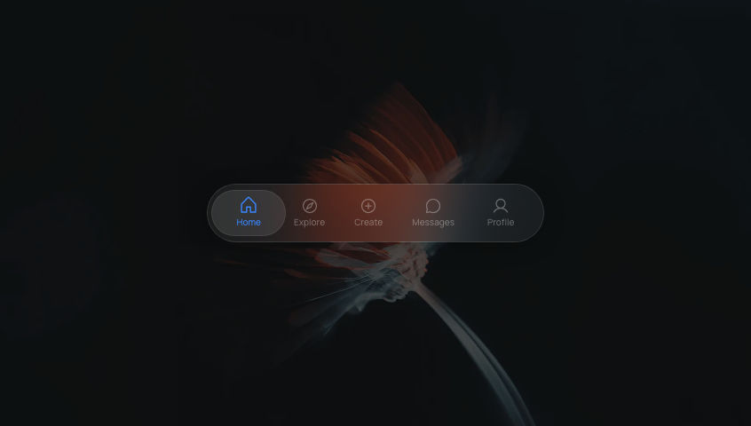
Glass SidebarCollapsible glassmorphism sidebar with icon-only and full label states, spring-animated expand and collapse.
NavigationGlassFramer Motion
Dark mode only
Refresh
Full screen
.png)
'use client'
// npm install @phosphor-icons/react framer-motion
import { useState, useEffect } from 'react'
import { motion, useSpring, AnimatePresence } from 'framer-motion'
import {
House,
MagnifyingGlass,
Folders,
Bell,
ChartLine,
Gear,
User,
ArrowRight,
ArrowLeft,
} from '@phosphor-icons/react'
// ─── Constants ────────────────────────────────────────────────────────────────
const COLLAPSED_WIDTH = 64
const EXPANDED_WIDTH = 220
// Design size for icon tiles — intentionally fixed, not responsive
const ICON_TILE_SIZE = 44
const TOGGLE_BUTTON_HEIGHT = 36
const NAV_ITEMS = [
{ icon: House, label: 'Home', color: '#3A86FF' },
{ icon: MagnifyingGlass, label: 'Search', color: '#B388FF' },
{ icon: Folders, label: 'Projects', color: '#FFBE0B' },
{ icon: Bell, label: 'Notifications', color: '#FF5C8A' },
{ icon: ChartLine, label: 'Analytics', color: '#06D6A0' },
{ icon: Gear, label: 'Settings', color: '#C9A96E' },
{ icon: User, label: 'Profile', color: '#FF7B54' },
] as const
type NavItem = (typeof NAV_ITEMS)[number]
// Blur is on a separate non-animating layer so it isn't recalculated every spring frame
const GLASS_BLUR_STYLE = {
backdropFilter: 'blur(24px) saturate(1.8)',
WebkitBackdropFilter: 'blur(24px) saturate(1.8)',
} as const
const GLASS_STYLE = {
background: 'rgba(255, 255, 255, 0.06)',
border: '1px solid rgba(255, 255, 255, 0.1)',
boxShadow: '0 8px 40px rgba(0, 0, 0, 0.4), inset 0 1px 0 rgba(255, 255, 255, 0.08)',
} as const
// ─── Sub-components ───────────────────────────────────────────────────────────
function NavItemRow({
item,
index,
isActive,
isOpen,
onActivate,
}: {
item: NavItem
index: number
isActive: boolean
isOpen: boolean
onActivate: () => void
}) {
const [hovered, setHovered] = useState(false)
const Icon = item.icon
// Reset stuck hover state when sidebar opens/closes — avoids tooltip lingering
useEffect(() => { setHovered(false) }, [isOpen])
return (
<div className="relative flex w-full items-center">
{/* Tooltip — only shown in collapsed state to surface the hidden label */}
<AnimatePresence>
{!isOpen && hovered && (
<motion.div
key="tooltip"
initial={{ opacity: 0, x: -6 }}
animate={{ opacity: 1, x: 0 }}
exit={{ opacity: 0, x: -6 }}
transition={{ duration: 0.15 }}
className="pointer-events-none absolute left-[calc(100%+10px)] z-50 whitespace-nowrap rounded-lg px-3 py-1.5 text-xs font-semibold text-white/90 font-sans"
style={{ ...GLASS_STYLE, ...GLASS_BLUR_STYLE }}
>
{item.label}
</motion.div>
)}
</AnimatePresence>
{/* Icon tile + label row */}
<motion.button
onClick={onActivate}
onMouseEnter={() => setHovered(true)}
onMouseLeave={() => setHovered(false)}
animate={{
// Collapsed: nudge right + scale up more to signal interactivity without a label
scale: hovered ? (isOpen ? 1.08 : 1.15) : 1,
x: hovered ? (isOpen ? 0 : 3) : 0,
}}
whileTap={{ scale: 0.90 }}
// stiffness 320 / damping 20 — snappy enough to feel physical without overshooting
transition={{ type: 'spring', stiffness: 320, damping: 20 }}
className="flex w-full items-center gap-3 rounded-xl cursor-pointer justify-start"
style={{ background: 'transparent', border: 'none', outline: 'none' }}
aria-label={item.label}
>
{/* Icon tile — notification-style tinted badge */}
<motion.div
className="flex shrink-0 items-center justify-center rounded-xl"
style={{
width: ICON_TILE_SIZE,
height: ICON_TILE_SIZE,
background: isActive ? `${item.color}28` : `${item.color}18`,
border: `1px solid ${isActive ? `${item.color}44` : `${item.color}22`}`,
transition: 'background 0.2s, border-color 0.2s',
}}
>
<Icon size={20} weight="regular" style={{ color: item.color }} />
</motion.div>
{/* Label — only rendered when sidebar is open */}
<AnimatePresence>
{isOpen && (
<motion.span
key="label"
initial={{ opacity: 0, x: -8 }}
animate={{ opacity: 1, x: 0, transition: { duration: 0.18, ease: 'easeOut', delay: 0.18 + index * 0.03 } }}
exit={{ opacity: 0, x: -6, transition: { duration: 0.08, ease: 'easeIn', delay: 0 } }}
className="whitespace-nowrap text-sm font-semibold font-sans"
style={{
color: isActive ? item.color : 'rgba(255,255,255,0.75)',
}}
>
{item.label}
</motion.span>
)}
</AnimatePresence>
</motion.button>
</div>
)
}
// ─── Main component ───────────────────────────────────────────────────────────
export default function GlassSidebar() {
const [isOpen, setIsOpen] = useState(false)
const [activeIndex, setActiveIndex] = useState(0)
const [toggleHovered, setToggleHovered] = useState(false)
// Spring width gives the expand/collapse a physical, momentum-based feel
const widthSpring = useSpring(COLLAPSED_WIDTH, { stiffness: 280, damping: 26 })
function toggle() {
const next = !isOpen
setIsOpen(next)
widthSpring.set(next ? EXPANDED_WIDTH : COLLAPSED_WIDTH)
}
return (
<div className="relative flex min-h-screen w-full items-center justify-center overflow-hidden bg-[#1A1A19]">
{/* Background image */}
<img
src="https://ik.imagekit.io/aitoolkit/bg%20images/Ethereal%20pink%20Flower%20%20(1).png"
alt=""
className="pointer-events-none absolute inset-0 h-full w-full object-cover opacity-60"
/>
{/* Fixed-width anchor: keeps the left edge stable so the sidebar expands rightward */}
<div style={{ width: EXPANDED_WIDTH }} className="flex items-center justify-start">
{/* Sidebar panel */}
<motion.div
style={{
width: widthSpring,
...GLASS_STYLE,
}}
initial={{ x: -20 }}
animate={{ x: 0 }}
// delay: 0.1s lets the background settle before the sidebar slides in
transition={{ type: 'spring', stiffness: 200, damping: 22, delay: 0.1 }}
className="relative isolate flex h-auto flex-col items-center gap-2 overflow-visible rounded-3xl px-2.5 py-3"
>
{/* Blur layer — absolute, never animates, so blur is not recalculated every spring frame */}
<div
className="pointer-events-none absolute inset-0 z-[-1] rounded-3xl"
style={GLASS_BLUR_STYLE}
/>
{/* Nav items */}
<div className="flex w-full flex-col gap-1.5">
{NAV_ITEMS.map((item, i) => (
<NavItemRow
key={item.label}
item={item}
index={i}
isActive={activeIndex === i}
isOpen={isOpen}
onActivate={() => setActiveIndex(i)}
/>
))}
</div>
{/* Divider */}
<div
className="my-1 w-full"
style={{ height: 1, background: 'rgba(255,255,255,0.1)' }}
/>
{/* Toggle button */}
<div className={`flex w-full items-center ${isOpen ? 'justify-start px-1' : 'justify-center'}`}>
<motion.button
onClick={toggle}
onMouseEnter={() => setToggleHovered(true)}
onMouseLeave={() => setToggleHovered(false)}
animate={{ scale: toggleHovered ? 1.08 : 1 }}
whileTap={{ scale: 0.90 }}
transition={{ type: 'spring', stiffness: 300, damping: 20 }}
className="flex items-center justify-center rounded-2xl cursor-pointer"
style={{
width: ICON_TILE_SIZE,
height: TOGGLE_BUTTON_HEIGHT,
background: 'rgba(255,255,255,0.08)',
border: '1px solid rgba(255,255,255,0.12)',
outline: 'none',
}}
aria-label={isOpen ? 'Collapse sidebar' : 'Expand sidebar'}
>
{/* Arrow spins 90° on enter/exit — gives the swap a sense of rotation direction */}
<AnimatePresence mode="wait" initial={false}>
{isOpen ? (
<motion.span
key="left"
initial={{ opacity: 0, rotate: 90 }}
animate={{ opacity: 1, rotate: 0 }}
exit={{ opacity: 0, rotate: -90 }}
transition={{ duration: 0.18 }}
>
<ArrowLeft size={18} weight="regular" className="text-white/70" />
</motion.span>
) : (
<motion.span
key="right"
initial={{ opacity: 0, rotate: -90 }}
animate={{ opacity: 1, rotate: 0 }}
exit={{ opacity: 0, rotate: 90 }}
transition={{ duration: 0.18 }}
>
<ArrowRight size={18} weight="regular" className="text-white/70" />
</motion.span>
)}
</AnimatePresence>
</motion.button>
</div>
</motion.div>
</div>
</div>
)
}
Add to your project
One command adds this component to your project.
1
Run the following command. New project? Run npx shadcn@latest init first to set up Tailwind and path aliases.
npx shadcn@latest add @aicanvas/glass-sidebar2
For dark mode, add the dark class to your <html> element:
<html class="dark">