// npm install framer-motion

Root element: className="flex min-h-screen w-full flex-col items-center justify-center bg-[#E8E8DF] dark:bg-[#1A1A19]"
The source ships h-full because AI Canvas renders it inside a sized preview frame. A standalone paste needs min-h-screen, or an ancestor with a real height, or the root collapses and takes its absolute layers with it.

Before building, verify your project has the following setup:
- React / Next.js
- TypeScript
- Tailwind CSS v4

If any are missing, set up via the shadcn CLI:
  npx shadcn@latest init

---

Create `components-workspace/slide-deck/index.tsx`. Export a named function `SlideDeck`. Single file, `'use client'`, no `any`.

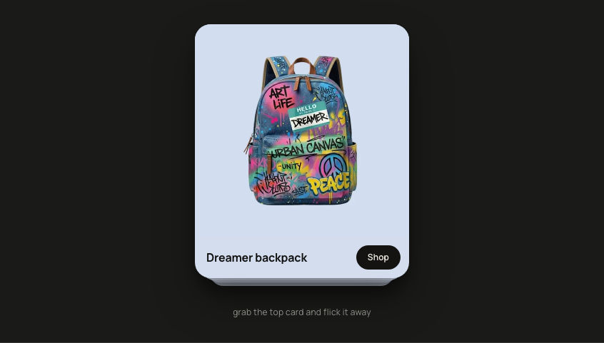
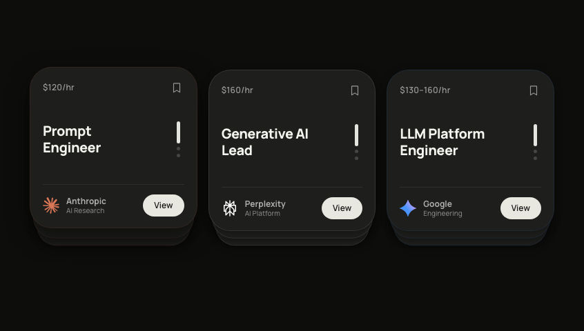
A swipeable editorial card deck with 4 cards always mounted in a layered stack. The top 3 are visible (y-offset + scale gives depth). Swiping forward flies the top card out left and reveals the one behind it. Swiping backward slides the new card in from the right, on top.

## Slides
```ts
const SLIDES = [
  { id:0, num:'01', label:'Opportunity', title:'Define the\nProblem Space',
    accent:'#E55A2B', bg:'#111111', textPrimary:'#FFFFFF', textMuted:'rgba(255,255,255,0.35)', shape:'circle' },
  { id:1, num:'02', label:'Strategy',    title:'Discover\nDirection',
    accent:'#E55A2B', bg:'#F0EDEA', textPrimary:'#111111', textMuted:'rgba(0,0,0,0.35)',       shape:'square' },
  { id:2, num:'03', label:'Execution',   title:'Design &\nDeliver',
    accent:'#111111', bg:'#E55A2B', textPrimary:'#FFFFFF', textMuted:'rgba(255,255,255,0.5)',  shape:'line'   },
  { id:3, num:'04', label:'Metrics',     title:'Measure\nImpact',
    accent:'#E55A2B', bg:'#2A2A2A', textPrimary:'#F0EDEA', textMuted:'rgba(240,237,234,0.4)', shape:'triangle' },
]
```

## Stack model
CARD_W=260, CARD_H=300, border-radius 20.
```ts
const STACK = [
  { x:0, y:0,  scale:1.000, opacity:1 },   // front
  { x:0, y:11, scale:0.962, opacity:1 },   // second
  { x:0, y:20, scale:0.926, opacity:1 },   // third
]
const OFFSCREEN = { x:0, y:30, scale:0.88, opacity:0 }
```
offset = (slide.id - current + 4) % 4. Cards at offset 0/1/2 use STACK; offset 3 uses OFFSCREEN.

## Navigation state
- `exitInfo: { slideId, xTarget } | null`, forward only: departed card flies to xTarget (-380)
- `enterFromRight: number | null`, backward only: entering card's id

Forward (dir=1): set exitInfo (xTarget:-380). The card at offset 3 (SLIDES.length-1) with matching slideId is isExiting=true → animTarget {x:-380,y:0,scale:0.88,opacity:0}, zIndex 15.

Backward (dir=-1): set enterFromRight to newIdx's slideId. The card becoming offset 0 gets key `${id}-right` and initial `{x:380,opacity:0,scale:0.88,y:0}` so Framer Motion starts it off-screen right. Give it zIndex 20 (highest). No exitInfo, so the old front card just springs back to STACK[1].

Clear both with onAnimationComplete using functional setState.

## Per-card render
```ts
const isExiting = exitInfo?.slideId === slide.id && offset === SLIDES.length - 1
const isEnteringFromRight = enterFromRight === slide.id && offset === 0

const animTarget = isExiting
  ? { x: exitInfo!.xTarget, y: 0, scale: 0.88, opacity: 0 }
  : offset <= 2 ? STACK[offset] : OFFSCREEN

const zIndex = isEnteringFromRight ? 20 : isExiting ? 15
  : offset === 0 ? 10 : offset === 1 ? 6 : offset === 2 ? 2 : 0
```
Spring: stiffness 300, damping 28. Drag x-axis on offset-0 card only, dragElastic 0.5, dismiss at |offset.x|>60 or |velocity|>400.

## Card content layout
Padding 24px 28px 28px, flex column, space-between.
- Top row: label (10px, 700, 0.12em tracking, uppercase, textMuted), then slide counter "XX / 04" (11px, 700, textMuted)
- Bottom: big slide number (88px, 900, lineHeight 0.85, -0.05em tracking, accent colour) then title (26px, 800, lineHeight 1.15, -0.03em, pre-line, textPrimary)

## Geometric decorations (ShapeDecor component)
- circle: div, 128×128, border-radius 50%, border 2px solid accent, opacity 0.15, position right:-32 top:-32
- square: div, 60×60, border 2px solid accent, rotate 15deg, opacity 0.25, right:20 top:30
- line: two vertical divs (w:2 opacity:0.1 right:28, w:1 opacity:0.06 right:38), full height, bg primary
- triangle: SVG 126×112, viewBox "0 0 180 160", polygon points "90,12 172,148 8,148", stroke primary sw:2 strokeLinejoin round, opacity 0.2, right:-24 top:-18

## Navigation
Dot indicators only (no arrows). motion.button per slide: height 6, animate width 6→24 (active), bg #E55A2B active / rgba(255,255,255,0.18) or rgba(0,0,0,0.15) inactive, spring stiffness 400 damping 30.

## Theme detection
isDark via MutationObserver on document.documentElement class. Affects: dot inactive colour, card box-shadow.
Container: `className="flex h-full w-full flex-col items-center justify-center bg-[#E8E8DF] dark:bg-[#1A1A19]"`.

## Typography
- Font: project default sans-serif
- Sizes: 10px, 11px, 26px, 88px
- Weights: 700, 800, 900
 AI Canvas