Components/Glass
Glassmorphism components for React: navbars, cards, modals, sliders, toggles, and more. Built with Tailwind CSS and Motion, ready to copy and paste.
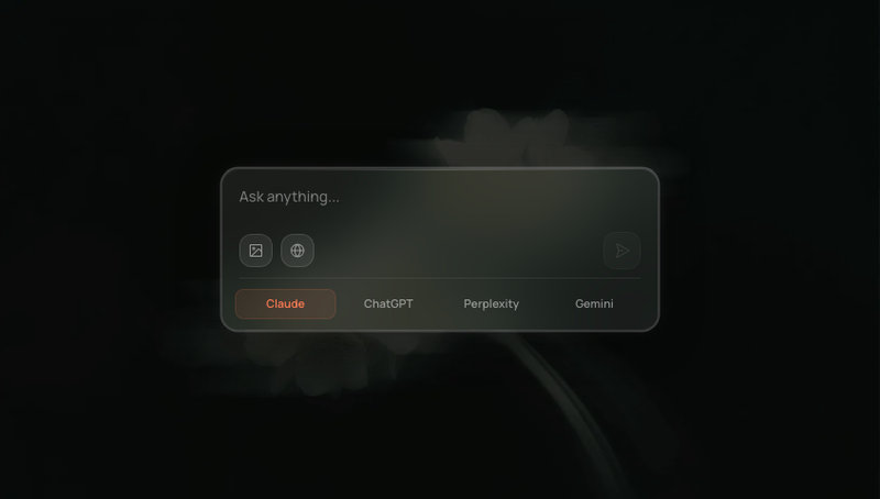
Glassmorphism AI chat input with image upload, web search toggle, and model switcher.
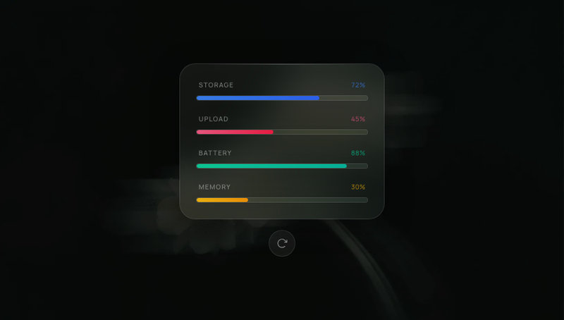
Glassmorphism progress bar panel with glowing gradient fills, spring-animated counters, staggered reveal, and replay button.
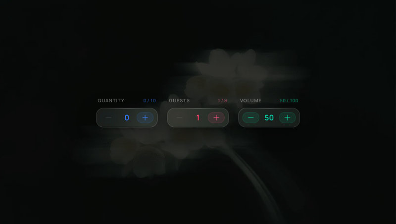
Glassmorphism numeric stepper with spring number flip, notification-style tinted buttons, and configurable min/max/step.
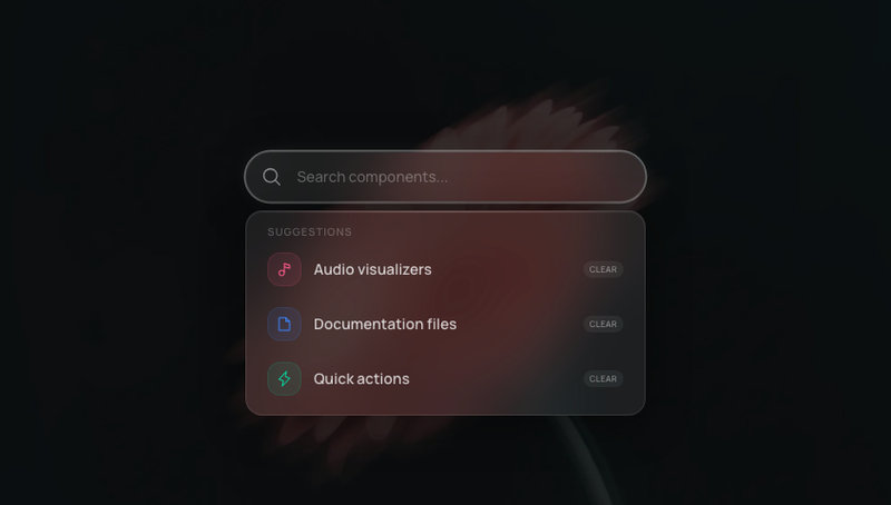
Glassmorphism search bar with animated suggestion dropdown, active state glow, and reduced-motion support.
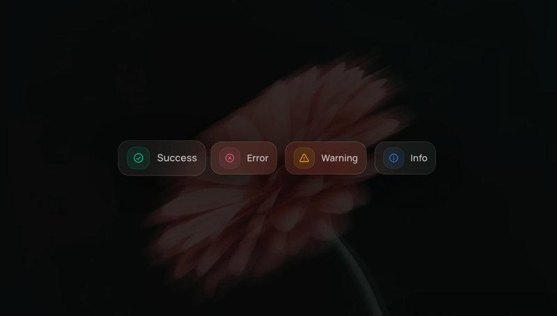
Frosted glassmorphism toast notification stack with 4 variants, auto-dismiss progress bar, and spring-animated stacking.
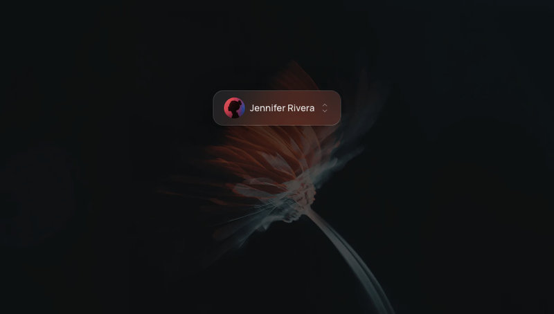
Frosted glass user avatar trigger with animated dropdown, grouped menu items, and Log Out.
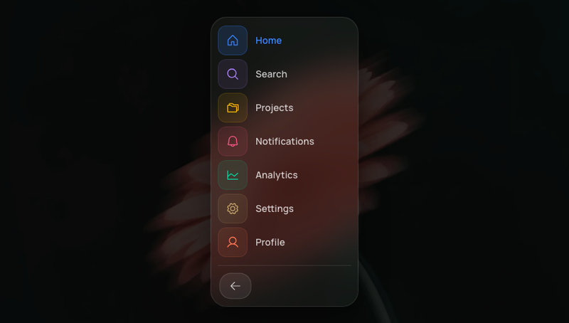
Collapsible glassmorphism sidebar with icon-only and full label states, spring-animated expand and collapse.
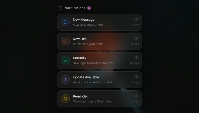
Swipe-to-dismiss notification stack with glass cards and spring-animated layout transitions.
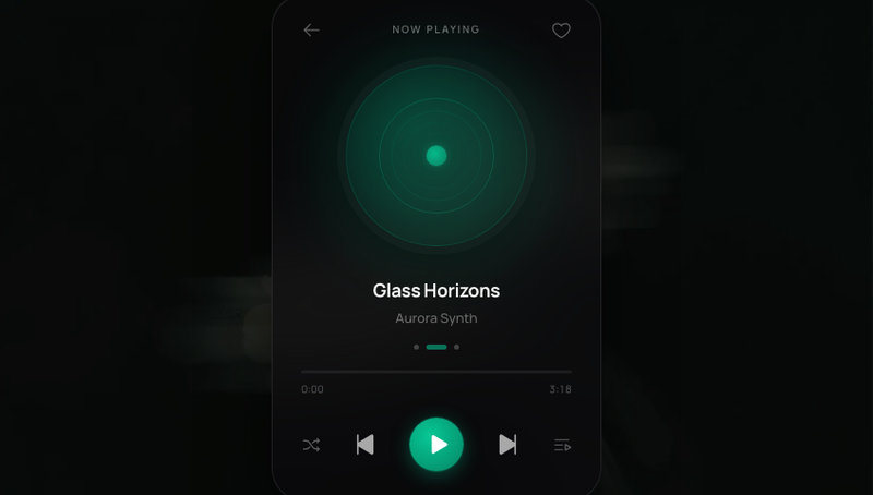
Mini music player with glass surface, spinning vinyl art, animated progress bar, and ambient glow.
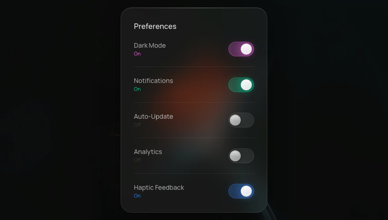
On/off toggles with glass housing and liquid-feel spring animation. Track color transitions smoothly.
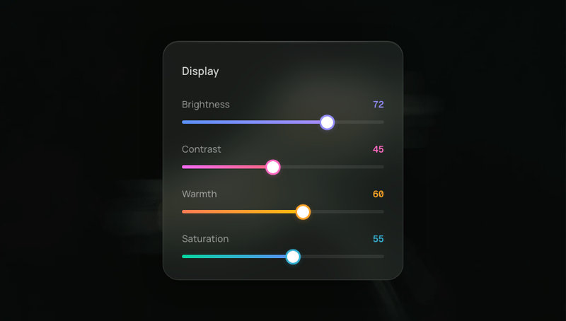
Range sliders with glass tracks, glowing colored fills, and spring-animated thumbs that scale on drag.
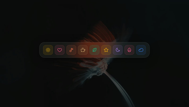
Glassmorphism macOS-style dock with cursor-proximity magnification. Icons scale with spring physics as the mouse approaches.
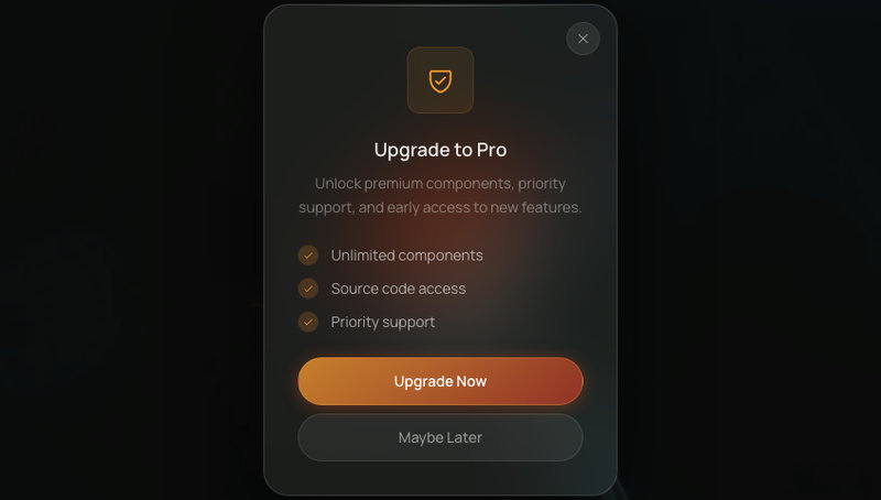
Centered dialog with deep glass blur, scale-spring entrance, and staggered content reveal.
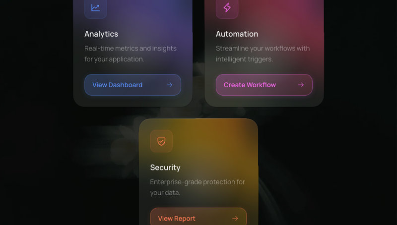
Glassmorphism content cards with 3D tilt-on-hover, spring physics, and a cursor-following glare highlight.
Selectable pill-shaped tags with glass surfaces, unique color accents, and spring-animated check marks.
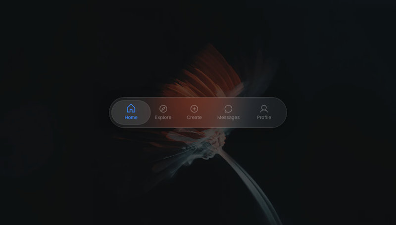
Frosted glass pill tab bar with a sliding active indicator. Edge tabs snap flush to the container wall.
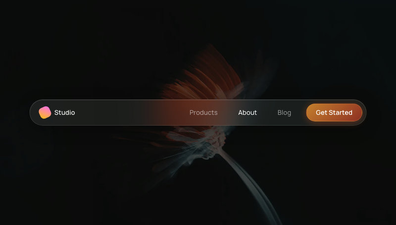
Frosted glass navigation bar with animated active tab indicator, ambient color blobs, and spring-physics entrance.