Components & Blocks/Inputs & Controls

Standalone: Components & Blocks

Animated React Inputs and Controls

Animated input and control components for React. Built with Tailwind CSS and Motion, ready to copy and paste or install via the shadcn CLI.

Premium
Filter Menu

Filter Menu

A skeuomorphic pill that expands into a multi-select filter checklist with Apply.

View Component
Free
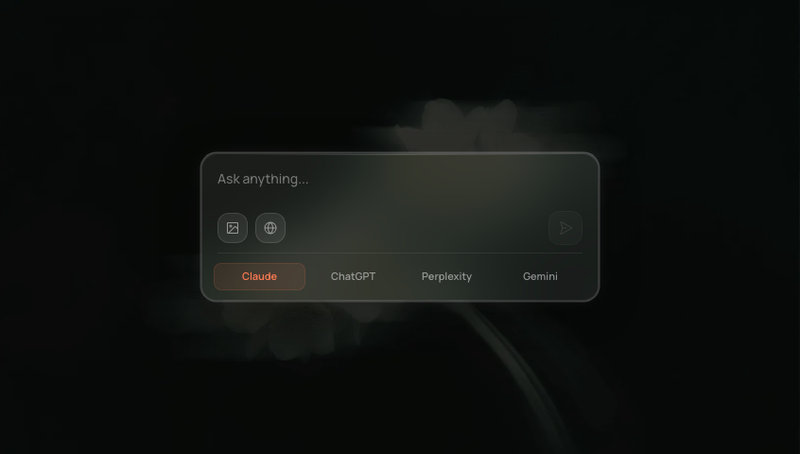
Glass AI Composer

Glass AI Composer

Glassmorphism AI chat input with image upload, web search toggle, and model switcher.

View Component
Free
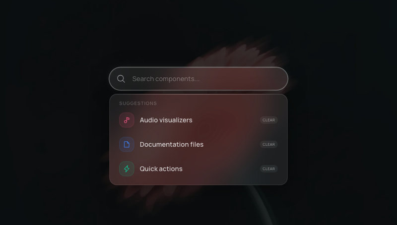
Glass Search Bar

Glass Search Bar

Glassmorphism search bar with animated suggestion dropdown, active state glow, and reduced-motion support.

View Component
Free
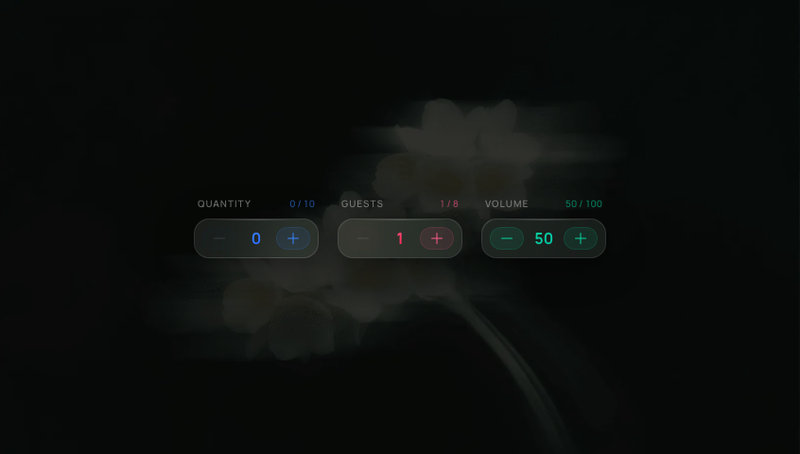
Glass Stepper

Glass Stepper

Glassmorphism numeric stepper with spring number flip, notification-style tinted buttons, and configurable min/max/step.

View Component
Free
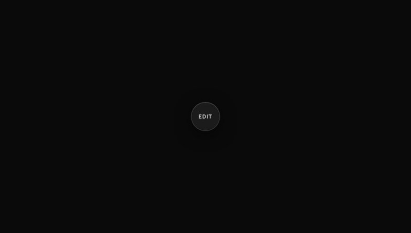
Radial Toolbar

Radial Toolbar

A radial context menu that fans out formatting tools around a centre button, with active toggle states and an animated label pill.

View Component
Free
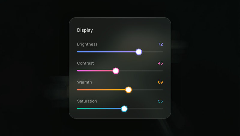
Glass Slider

Glass Slider

Range sliders with glass tracks, glowing colored fills, and spring-animated thumbs that scale on drag.

View Component

© 2026 AI Canvas - AI Native Components, Design Systems and Templates

ComponentsAndromeda ProAndromeda LegacyPricingContactFeedbackFAQPrivacy PolicyTermsRefundPremium LicenseVerträge hier kündigenImpressumCreditsshadcn registry@aicanvas/mcp
AI Canvas
Design Systems
  • Andromeda ProNew
  • Andromeda Legacy
Components & Blocks
  • All Components
  • Cards & Modals
  • Widgets
  • Backgrounds
  • Blocks
  • Buttons & Toggles
  • Navigation
  • Inputs & Controls
  • Notifications
  • Typography
  • Glass
  • 3D & Shaders
Get MCPPricingAboutFAQContactFeedback
AI Canvas
Components & Blocks/Inputs & Controls