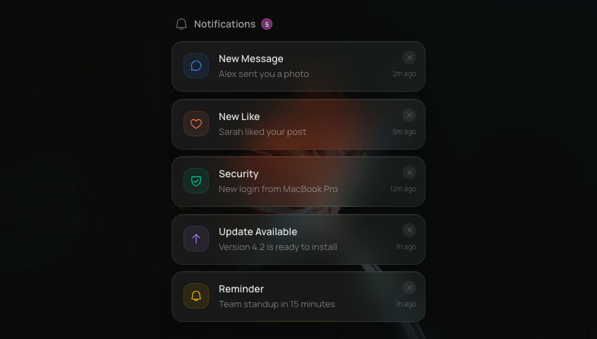
Glass ToastFrosted glassmorphism toast notification stack with 4 variants, auto-dismiss progress bar, and spring-animated stacking.
NotificationsGlassInteractive
Dark mode only
Refresh
Full screen
.png)
'use client'
// npm install @phosphor-icons/react framer-motion
import { useState, useRef, useEffect, useCallback } from 'react'
import { motion, AnimatePresence, useReducedMotion } from 'framer-motion'
import {
CheckCircle,
XCircle,
Warning,
Info,
X,
} from '@phosphor-icons/react'
// ─── Constants ────────────────────────────────────────────────────────────────
const GLASS_BLUR = {
backdropFilter: 'blur(24px) saturate(1.8)',
WebkitBackdropFilter: 'blur(24px) saturate(1.8)',
} as const
const GLASS_PANEL = {
background: 'rgba(255, 255, 255, 0.06)',
border: '1px solid rgba(255, 255, 255, 0.1)',
boxShadow:
'0 8px 40px rgba(0, 0, 0, 0.4), inset 0 1px 0 rgba(255, 255, 255, 0.08)',
} as const
const BACKGROUND_IMAGE =
'https://ik.imagekit.io/aitoolkit/bg%20images/Ethereal%20pink%20Flower%20%20(1).png'
const TOAST_DURATION = 4000
const MAX_TOASTS = 3
// ─── Types ────────────────────────────────────────────────────────────────────
type ToastVariant = 'success' | 'error' | 'warning' | 'info'
interface Toast {
id: string
variant: ToastVariant
title: string
description?: string
}
interface VariantConfig {
color: string
gradient: string
icon: typeof CheckCircle
label: string
}
const VARIANTS: Record<ToastVariant, VariantConfig> = {
success: { color: '#06D6A0', gradient: '#06D6A0, #00BFA5', icon: CheckCircle, label: 'Success' },
error: { color: '#FF5C8A', gradient: '#FF5C8A, #FF1744', icon: XCircle, label: 'Error' },
warning: { color: '#FFBE0B', gradient: '#FFBE0B, #FF9800', icon: Warning, label: 'Warning' },
info: { color: '#3A86FF', gradient: '#3A86FF, #2962FF', icon: Info, label: 'Info' },
}
const DEMO_TOASTS: Record<ToastVariant, { title: string; description: string }> = {
success: { title: 'Changes saved', description: 'Your settings have been updated successfully' },
error: { title: 'Upload failed', description: 'The file exceeds the maximum size limit' },
warning: { title: 'Low storage', description: 'You have less than 100MB remaining' },
info: { title: 'New update', description: 'Version 2.4 is now available' },
}
// ─── Spring configs ───────────────────────────────────────────────────────────
const ENTER_SPRING = { type: 'spring' as const, stiffness: 300, damping: 26 }
const BUTTON_SPRING = { type: 'spring' as const, stiffness: 300, damping: 20 }
// ─── Progress bar — RAF-based with pause/resume ──────────────────────────────
function useToastProgress(
id: string,
isPaused: boolean,
onComplete: (id: string) => void,
) {
const progressRef = useRef<HTMLDivElement>(null)
const elapsedRef = useRef(0)
const lastTimeRef = useRef(0)
const rafRef = useRef(0)
useEffect(() => {
let alive = true
lastTimeRef.current = performance.now()
function tick(now: number) {
if (!alive) return
if (!isPaused) {
const delta = now - lastTimeRef.current
elapsedRef.current += delta
}
lastTimeRef.current = now
const fraction = Math.max(0, 1 - elapsedRef.current / TOAST_DURATION)
if (progressRef.current) {
progressRef.current.style.transform = `scaleX(${fraction})`
}
if (fraction <= 0) {
onComplete(id)
return
}
rafRef.current = requestAnimationFrame(tick)
}
rafRef.current = requestAnimationFrame(tick)
return () => {
alive = false
cancelAnimationFrame(rafRef.current)
}
}, [id, isPaused, onComplete])
return progressRef
}
// ─── Individual toast card ───────────────────────────────────────────────────
function ToastCard({
toast,
onDismiss,
prefersReduced,
}: {
toast: Toast
onDismiss: (id: string) => void
prefersReduced: boolean | null
}) {
const [hovered, setHovered] = useState(false)
const variant = VARIANTS[toast.variant]
const Icon = variant.icon
const handleComplete = useCallback(
(id: string) => onDismiss(id),
[onDismiss],
)
const progressRef = useToastProgress(toast.id, hovered, handleComplete)
const enterAnim = prefersReduced
? { opacity: 0 }
: { opacity: 0, x: 80, scale: 0.95 }
const showAnim = prefersReduced
? { opacity: 1 }
: { opacity: 1, x: 0, scale: 1 }
const exitAnim = prefersReduced
? { opacity: 0 }
: { opacity: 0, x: 80, scale: 0.95 }
return (
<motion.div
layout
initial={enterAnim}
animate={{
...showAnim,
scale: hovered && !prefersReduced ? 1.01 : 1,
}}
exit={exitAnim}
transition={ENTER_SPRING}
onMouseEnter={() => setHovered(true)}
onMouseLeave={() => setHovered(false)}
className="relative w-full overflow-hidden rounded-2xl"
style={{ ...GLASS_PANEL }}
>
{/* Blur layer — non-animating */}
<div
className="pointer-events-none absolute inset-0 z-0 rounded-2xl"
style={GLASS_BLUR}
/>
{/* Content row */}
<div className="relative z-10 flex items-center gap-3 py-3.5 pl-4 pr-10">
{/* Icon tile — notification-style tinted badge */}
<div
className="flex shrink-0 items-center justify-center rounded-xl"
style={{
width: 36,
height: 36,
background: `${variant.color}18`,
border: `1px solid ${variant.color}22`,
}}
>
<Icon size={18} weight="regular" style={{ color: variant.color }} />
</div>
{/* Text area */}
<div className="flex min-w-0 flex-1 flex-col">
<span className="truncate text-sm font-semibold text-white/90 font-sans">
{toast.title}
</span>
{toast.description && (
<span className="mt-0.5 truncate text-xs text-white/50 font-sans">
{toast.description}
</span>
)}
</div>
</div>
{/* Close button — matches glass-search-bar X button */}
{/* Outer div provides 44px touch target; inner styled circle is 20×20 visual */}
<div
className="absolute right-0 top-1/2 z-20 flex -translate-y-1/2 cursor-pointer items-center justify-center"
style={{ width: 44, height: 44 }}
onClick={() => onDismiss(toast.id)}
>
<motion.div
whileHover={{ backgroundColor: 'rgba(255, 255, 255, 0.14)' }}
whileTap={{ scale: 0.88 }}
className="flex items-center justify-center rounded-full"
style={{
width: 20,
height: 20,
background: 'rgba(255, 255, 255, 0.08)',
border: '1px solid rgba(255, 255, 255, 0.12)',
}}
role="button"
aria-label="Dismiss toast"
>
<X size={10} weight="regular" className="text-white/60" />
</motion.div>
</div>
{/* Progress bar */}
<div className="absolute bottom-0 left-0 right-0 h-[2px]">
<div
ref={progressRef}
className="h-full w-full origin-left"
style={{ background: `${variant.color}99` }}
/>
</div>
</motion.div>
)
}
// ─── Trigger button ──────────────────────────────────────────────────────────
function TriggerButton({
variant,
onTrigger,
}: {
variant: ToastVariant
onTrigger: () => void
}) {
const config = VARIANTS[variant]
const Icon = config.icon
return (
<motion.button
onClick={onTrigger}
whileHover={{ scale: 1.08 }}
whileTap={{ scale: 0.90 }}
transition={BUTTON_SPRING}
className="relative isolate flex cursor-pointer items-center gap-2.5 overflow-hidden rounded-2xl px-3 py-2 font-sans"
style={{
...GLASS_PANEL,
outline: 'none',
minHeight: 44,
}}
>
{/* Blur layer — non-animating */}
<div
className="pointer-events-none absolute inset-0 z-[-1] rounded-2xl"
style={GLASS_BLUR}
/>
{/* Icon badge — notification-style tinted */}
<div
className="flex shrink-0 items-center justify-center rounded-xl"
style={{
width: 32,
height: 32,
background: `${config.color}18`,
border: `1px solid ${config.color}22`,
}}
>
<Icon size={16} weight="regular" style={{ color: config.color }} />
</div>
<span className="text-sm font-semibold text-white/70">{config.label}</span>
</motion.button>
)
}
// ─── Main component ──────────────────────────────────────────────────────────
export default function GlassToast() {
const [toasts, setToasts] = useState<Toast[]>([])
const prefersReduced = useReducedMotion()
const idCounter = useRef(0)
const dismissToast = useCallback((id: string) => {
setToasts((prev) => prev.filter((t) => t.id !== id))
}, [])
const addToast = useCallback((variant: ToastVariant) => {
const demo = DEMO_TOASTS[variant]
const id = `toast-${++idCounter.current}`
setToasts((prev) => {
const next = [...prev, { id, variant, ...demo }]
// Enforce max visible — remove oldest first
if (next.length > MAX_TOASTS) {
return next.slice(next.length - MAX_TOASTS)
}
return next
})
}, [])
return (
<div className="flex min-h-screen w-full items-center justify-center bg-[#1A1A19]">
{/* Background image */}
<img
src={BACKGROUND_IMAGE}
alt=""
className="pointer-events-none absolute inset-0 h-full w-full object-cover opacity-60"
/>
{/* Trigger buttons — centered, wrap on mobile */}
<div className="relative z-10 flex flex-wrap items-center justify-center gap-3 px-4">
{(Object.keys(VARIANTS) as ToastVariant[]).map((variant) => (
<TriggerButton
key={variant}
variant={variant}
onTrigger={() => addToast(variant)}
/>
))}
</div>
{/* Toast container — full width on mobile, 380px on desktop */}
<div className="fixed bottom-4 left-4 right-4 z-50 flex flex-col-reverse gap-3 sm:bottom-6 sm:left-auto sm:right-6 sm:w-[380px]">
<AnimatePresence mode="popLayout" initial={false}>
{toasts.map((toast) => (
<ToastCard
key={toast.id}
toast={toast}
onDismiss={dismissToast}
prefersReduced={prefersReduced}
/>
))}
</AnimatePresence>
</div>
</div>
)
}
Add to your project
One command adds this component to your project.
1
Run the following command. New project? Run npx shadcn@latest init first to set up Tailwind and path aliases.
npx shadcn@latest add @aicanvas/glass-toast2
For dark mode, add the dark class to your <html> element:
<html class="dark">