Glass Tab Bar
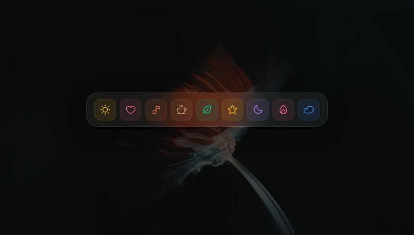
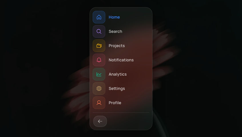
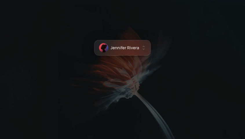
Frosted glass pill tab bar with a sliding active indicator.
.png?updatedAt=1775223702866)
Add to your project
One command adds this component to your project.
Run the following command. New project? Run npx shadcn@latest init first to set up Tailwind and path aliases.
npx shadcn@latest add @aicanvas/glass-tab-barFree account required. Signed out, this installs a placeholder file instead of the component.
For dark mode, add the dark class to your <html> element:
<html class="dark">Install with AI Canvas MCP
With AI Canvas MCP, your AI knows every component we ship. Ask for one inside Claude Code, Codex, or Cursor and it installs the component you pick. Works with any AI Canvas account, free or premium.
About Glass Tab Bar
Glass Tab Bar is a frosted pill row with a sliding active indicator that crosses behind the labels as you switch sections. The edge tabs are intentionally snapped flush to the container wall so the rhythm feels intentional rather than centered-with-padding. Motion drives the slider, and the glass surface adapts to whatever sits behind it through backdrop-filter. It works well as a settings switcher, a dashboard segment control, or a mobile-style tab row inside a larger page.
Built with
Frequently asked questions
- Is Glass Tab Bar free to use?
- Yes. Glass Tab Bar is part of the free AI Canvas library and is open source under the MIT license, so you can use it in personal and commercial projects.
- How do I install Glass Tab Bar?
- One command: npx shadcn@latest add https://aicanvas.me/r/glass-tab-bar.json, free with a free AI Canvas account. Or connect the AI Canvas MCP server and ask your AI editor to install Glass Tab Bar for you. You can also copy the source straight from the Code tab, no account needed. It works in any React project with Tailwind CSS.
- What is Glass Tab Bar built with?
- Glass Tab Bar is built with React and TypeScript, using Motion and Tailwind CSS.
- Where would I use Glass Tab Bar?
- Common uses include Dashboard, Settings, and Mobile app. Like every AI Canvas component, it is self-contained and drops into any React project.
- Can I remix Glass Tab Bar with AI?
- Yes. Glass Tab Bar ships with one comprehensive AI prompt written against the real source code. Open "Remix with AI" on this page to read and copy it into Claude, Cursor, ChatGPT, or any AI tool. Prompts are for remixing your own variation; for the exact component, install it with the one-command CLI.
 AI Canvas