'use client'
// npm install framer-motion
import { useEffect, useRef, useState } from 'react'
import {
AnimatePresence,
animate,
motion,
usePresence,
useMotionValue,
useTransform,
type PanInfo,
} from 'framer-motion'
// ─── Data ───────────────────────────────────────────────────────────────────
// Swap these for any images — the deck loops endlessly through them.
interface CardData {
title: string
image: string
label?: string
}
const CARDS: CardData[] = [
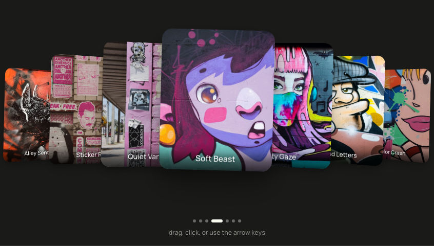
{
// Mural card — image only, no caption. The deck opens on this one.
title: '',
image: 'https://ik.imagekit.io/aitoolkit/product-card-deck/mural.jpg?tr=w-600',
},
{
title: 'Dreamer backpack',
label: 'Shop',
image: 'https://ik.imagekit.io/aitoolkit/product-card-deck/backpack.jpg?tr=w-600',
},
{
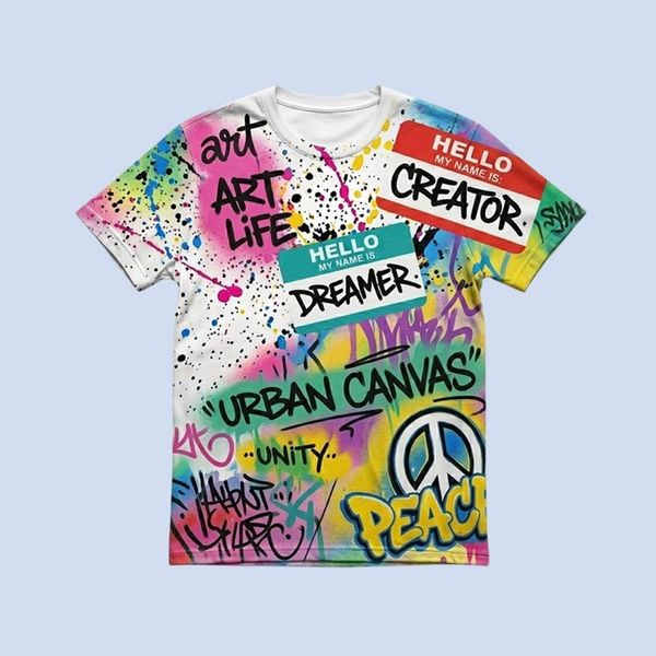
title: 'Creator graffiti tee',
label: 'Shop',
image: 'https://ik.imagekit.io/aitoolkit/product-card-deck/tee.jpg?tr=w-600',
},
{
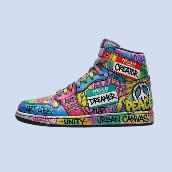
title: 'Dreamer high-tops',
label: 'Shop',
image: 'https://ik.imagekit.io/aitoolkit/product-card-deck/sneaker.jpg?tr=w-600',
},
{
title: 'Denim jacket',
label: 'Shop',
image: 'https://ik.imagekit.io/aitoolkit/product-card-deck/jacket.jpg?tr=w-600',
},
]
// ─── Stack geometry ─────────────────────────────────────────────────────────
// Slot 0 is the active (draggable) card; slots 1-3 peek behind it as a straight
// stack — the only rotation is the live drag-tilt below.
const VISIBLE = 4
const SLOT_Y = [0, 12, 24, 36]
const SLOT_SCALE = [1, 0.95, 0.9, 0.86]
const SLOT_OPACITY = [1, 1, 0.92, 0.82]
const SPRING = { type: 'spring' as const, stiffness: 300, damping: 30 }
// ─── Card face ───────────────────────────────────────────────────────────────
function CardFace({ card, isTop }: { card: CardData; isTop: boolean }) {
return (
<div
className="relative flex h-full w-full flex-col overflow-hidden"
style={{
borderRadius: 22,
backgroundColor: '#D3DDEE',
boxShadow: isTop
? '0 30px 60px rgba(0,0,0,0.30), 0 10px 20px rgba(0,0,0,0.20)'
: '0 14px 30px rgba(0,0,0,0.18)',
}}
>
{/* Container 1 — the picture. Fills the whole card on the textless mural. */}
<div className="relative w-full" style={{ flex: 1, minHeight: 0 }}>
<img
src={card.image}
alt={card.title || 'Urban Canvas'}
draggable={false}
loading="lazy"
className="absolute inset-0 h-full w-full object-cover"
/>
</div>
{/* Container 2 — name + button, on a clean strip below the picture. */}
{card.title && (
<div
className="flex items-center justify-between"
style={{ flexShrink: 0, gap: 12, padding: '12px 12px 12px 16px' }}
>
<h3
style={{
flex: 1,
minWidth: 0,
fontFamily: 'var(--font-sans, sans-serif)',
fontSize: 16,
fontWeight: 700,
lineHeight: 1.15,
letterSpacing: '-0.01em',
color: '#111111',
margin: 0,
whiteSpace: 'nowrap',
overflow: 'hidden',
textOverflow: 'ellipsis',
}}
>
{card.title}
</h3>
{card.label && (
<motion.button
type="button"
onPointerDown={(event) => event.stopPropagation()}
onClick={(event) => event.stopPropagation()}
whileHover={{ scale: 1.06, backgroundColor: '#2C2825' }}
whileTap={{ scale: 0.93, backgroundColor: '#000000' }}
transition={{ type: 'spring', stiffness: 500, damping: 30 }}
style={{
flexShrink: 0,
border: 'none',
cursor: 'pointer',
backgroundColor: '#141312',
color: '#F5F1E8',
// Fully rounded (pill) corners.
borderRadius: 9999,
padding: '8px 16px',
fontFamily: 'var(--font-sans, sans-serif)',
fontSize: 12,
fontWeight: 600,
letterSpacing: '0.01em',
}}
>
{card.label}
</motion.button>
)}
</div>
)}
</div>
)
}
// ─── One card in the deck ─────────────────────────────────────────────────────
// Owns its OWN motion values, so the top card can be dragged + tilted while the
// rest sit in their slots. When the deck advances, the card behind becomes the
// same element at slot 0 (no hand-off). When flicked it animates itself off via
// usePresence before unmounting.
function FlickCard({
card,
slot,
isTop,
onFlick,
}: {
card: CardData
slot: number
isTop: boolean
onFlick: () => void
}) {
const [isPresent, safeToRemove] = usePresence()
const x = useMotionValue(0)
const y = useMotionValue(SLOT_Y[slot])
const scale = useMotionValue(SLOT_SCALE[slot])
const opacity = useMotionValue(0)
// Drag-tilt: lean toward the horizontal drag, clamped to a gentle ±18°.
const rotate = useTransform(x, [-200, 200], [-18, 18], { clamp: true })
const flickVel = useRef({ x: 0, y: 0 })
// Settle into the current slot whenever it changes (the deck advancing). The
// background cards re-center horizontally; the top card leaves x to the drag.
useEffect(() => {
if (!isPresent) return
const controls = [
animate(y, SLOT_Y[slot], SPRING),
animate(scale, SLOT_SCALE[slot], SPRING),
animate(opacity, SLOT_OPACITY[slot], { duration: 0.3, ease: 'easeOut' }),
]
if (!isTop) controls.push(animate(x, 0, SPRING))
return () => controls.forEach((c) => c.stop())
}, [slot, isTop, isPresent, x, y, scale, opacity])
// Removed from the deck -> sail off in the flick direction, then unmount.
useEffect(() => {
if (isPresent) return
const v = flickVel.current
const mag = Math.hypot(v.x, v.y) || 1
animate(x, (v.x / mag) * 1500, { duration: 0.5, ease: 'easeOut' })
animate(y, (v.y / mag) * 1500, { duration: 0.5, ease: 'easeOut' })
animate(opacity, 0, { duration: 0.45, ease: 'easeOut' })
const last = animate(scale, 0.85, {
duration: 0.5,
ease: 'easeOut',
onComplete: () => safeToRemove?.(),
})
return () => last.stop()
}, [isPresent, safeToRemove, x, y, scale, opacity])
const handleDragEnd = (_: unknown, info: PanInfo) => {
const speed = Math.hypot(info.velocity.x, info.velocity.y)
const dist = Math.hypot(info.offset.x, info.offset.y)
if (speed > 500 || dist > 130) {
// On a far-but-slow drag the velocity is tiny — fall back to the drag
// direction so the card still flies the way it was pushed.
flickVel.current =
speed > 220
? { x: info.velocity.x, y: info.velocity.y }
: { x: info.offset.x * 9, y: info.offset.y * 9 }
onFlick()
} else {
// Weak release: spring back to the top slot.
animate(x, 0, SPRING)
animate(y, SLOT_Y[0], SPRING)
}
}
return (
<motion.div
style={{
x,
y,
scale,
opacity,
rotate,
position: 'absolute',
inset: 0,
zIndex: 100 - slot,
cursor: isTop ? 'grab' : 'auto',
// Only the draggable top card blocks touch-scroll; peeking cards don't.
touchAction: isTop ? 'none' : 'auto',
}}
drag={isTop}
onDragEnd={isTop ? handleDragEnd : undefined}
whileTap={isTop ? { cursor: 'grabbing' } : undefined}
>
<CardFace card={card} isTop={isTop} />
</motion.div>
)
}
// ─── ProductCardDeck ──────────────────────────────────────────────────────────
interface DeckCard {
key: number
content: number
}
export default function ProductCardDeck() {
const [deck, setDeck] = useState<DeckCard[]>(() =>
Array.from({ length: VISIBLE }, (_, i) => ({ key: i, content: i })),
)
const nextKey = useRef(VISIBLE)
// Drop the top card and append a fresh one at the back so the deck never ends.
const handleFlick = () => {
setDeck((prev) => {
const rest = prev.slice(1)
const lastContent = prev[prev.length - 1].content
const newCard = {
key: nextKey.current++,
content: (lastContent + 1) % CARDS.length,
}
return [...rest, newCard]
})
}
return (
<div className="relative flex min-h-screen w-full items-center justify-center overflow-hidden bg-[#E8E8DF] px-4 dark:bg-[#1A1A19]">
<div className="flex flex-col items-center gap-10">
<div
className="relative"
style={{
// Card = a (roughly square) picture container on top + a clean
// caption strip below it.
width: 'clamp(220px, 72vw, 300px)',
height: 'calc(clamp(220px, 72vw, 300px) + 56px)',
}}
>
<AnimatePresence>
{deck.map((item, i) => (
<FlickCard
key={item.key}
card={CARDS[item.content % CARDS.length]}
slot={i}
isTop={i === 0}
onFlick={handleFlick}
/>
))}
</AnimatePresence>
</div>
<p className="text-xs tracking-wide text-[#666662] dark:text-[#9E9E98]">
grab the top card and flick it away
</p>
</div>
</div>
)
}


 AI Canvas