// npm install framer-motion @phosphor-icons/react

Root element: className="relative flex min-h-screen w-full items-center justify-center overflow-hidden bg-[#1A1A19]"
The source ships h-full because AI Canvas renders it inside a sized preview frame. A standalone paste needs min-h-screen, or an ancestor with a real height, or the root collapses and takes its absolute layers with it.

Before building, verify your project has the following setup:
- React / Next.js
- TypeScript
- Tailwind CSS v4

If any are missing, set up via the shadcn CLI:
  npx shadcn@latest init

---

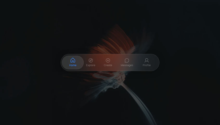
Create a React client component named `GlassNavbar`, a responsive frosted-glass pill navbar with layoutId active highlight, warm gradient CTA, and a mobile hamburger dropdown.

Write this as a single self-contained React client component. Inline everything. Do not extract helper hooks, utility functions, or separate files. 'use client' at the top. No 'any' types.

Background image (absolute inset-0 object-cover opacity-60 pointer-events-none):
`https://ik.imagekit.io/aitoolkit/bg%20images/Ethereal%20Orange%20Flower%201%20(1).png?updatedAt=1775223702866`

Constants:
- NAV_ITEMS = ['Products', 'About', 'Blog']
- glassStyle = { background:'rgba(255,255,255,0.08)', border:'1px solid rgba(255,255,255,0.12)', boxShadow:'0 8px 32px rgba(0,0,0,0.3), inset 0 1px 0 rgba(255,255,255,0.1)' }
- glassBlur  = { backdropFilter:'blur(24px) saturate(1.8)', WebkitBackdropFilter:'blur(24px) saturate(1.8)' }, applied on a separate child layer (so the spinning logo doesn't repaint the blur every frame)
- ctaStyle = { background:'linear-gradient(135deg, rgba(255,160,50,0.75), rgba(220,60,40,0.6))', border:'1px solid rgba(255,180,80,0.25)', boxShadow:'0 2px 16px rgba(220,80,30,0.4)' }
- ctaHoverStyle = { background:'linear-gradient(135deg, rgba(255,180,80,0.9), rgba(235,75,45,0.8))', boxShadow:'0 4px 24px rgba(220,80,30,0.6)' }

State: active (number|null, default null, nothing selected), hovered (number|null), menuOpen (boolean).

Root: relative flex h-full w-full items-center justify-center overflow-hidden bg-[#1A1A19]. Background <img>. Column wrapper: relative flex w-[calc(100%-2rem)] max-w-[720px] flex-col.

NAVBAR motion.nav: initial {y:-40} animate {y:0} transition {type:'spring', stiffness:200, damping:24}. className "relative isolate flex w-full items-center gap-1 rounded-full px-2 py-2". Style=glassStyle. Separate blur child (absolute inset-0 z-[-1] rounded-full glassBlur).

Logo div (flex items-center gap-2 px-3 cursor-pointer, onClick setActive(null)): spinning motion.div h-6 w-6 rounded-lg, background 'linear-gradient(135deg, #FF6BF5, #FFBE0B)', animate {rotate:[0,360]} transition {duration:20, repeat:Infinity, ease:'linear'}. Text: <span className="text-sm font-semibold text-white/90">Studio</span>.

flex-1 spacer.

Desktop group (hidden items-center gap-1 sm:flex): each NAV_ITEM → motion.button relative cursor-pointer rounded-full px-5 py-2 text-sm font-medium. Style color: (active===i || hovered===i) ? 'rgba(255,255,255,0.95)' : 'rgba(255,255,255,0.5)'. onHoverStart/End sets hovered. onClick sets active. whileTap {scale:0.97}. If active===i, render motion.div layoutId="glass-nav-active" absolute inset-0 rounded-full, style bg 'rgba(255,255,255,0.12)' border '1px solid rgba(255,255,255,0.1)', transition {type:'spring', stiffness:400, damping:30}. Label span: relative z-10. (No hover background, text color change only.)

"Get Started" motion.button (ml-2 rounded-full px-5 py-2 text-sm font-semibold text-white cursor-pointer): style=ctaStyle. whileHover {scale:1.04, ...ctaHoverStyle}. whileTap {scale:0.96}. transition {duration:0.25, ease:[0.25,0.1,0.25,1]}.

MOBILE hamburger motion.button (mr-2 flex cursor-pointer items-center justify-center rounded-full p-2 text-white/70 sm:hidden): style bg 'rgba(255,255,255,0.08)'. onClick toggles menuOpen. whileTap {scale:0.9}. Inside AnimatePresence mode="wait" initial={false}: menuOpen ? motion.span key="x" initial {rotate:-90, opacity:0} animate {rotate:0, opacity:1} exit {rotate:90, opacity:0} {duration:0.15} with <X size={18} weight="bold" /> : motion.span key="menu" initial {rotate:90, opacity:0} animate {rotate:0, opacity:1} exit {rotate:-90, opacity:0} with <List size={18} weight="bold" />.

MOBILE DROPDOWN: AnimatePresence wrapping motion.div (mt-2 relative isolate flex flex-col gap-1 rounded-2xl p-2 sm:hidden, style=glassStyle + blur layer inside). initial {opacity:0, y:-8, scale:0.97} animate {opacity:1, y:0, scale:1} exit {opacity:0, y:-8, scale:0.97} transition {duration:0.22, ease:[0.25,0.1,0.25,1]}. NAV_ITEMS map → plain buttons rounded-full px-5 py-2.5 text-left text-sm font-medium cursor-pointer. Style color: active===i? 'rgba(255,255,255,0.95)' : 'rgba(255,255,255,0.55)'; bg: active===i? 'rgba(255,255,255,0.1)' : 'transparent'. onClick setActive(i)+setMenuOpen(false). Final Get Started button mt-1 rounded-full px-5 py-2.5 text-sm font-semibold text-white, style=ctaStyle, onClick setMenuOpen(false).

Imports: useState from react; motion, AnimatePresence from framer-motion; List, X from @phosphor-icons/react.

## Typography
- Font: project default sans-serif
- Sizes: 14px
- Weights: 500, 600.png?updatedAt=1775223702866)
 AI Canvas