Expanding Tabs
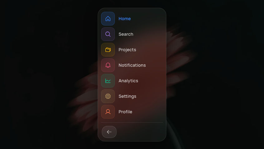
A monochrome tab bar of icon circles.
Add to your project
One command adds this component to your project.
Run the following command. New project? Run npx shadcn@latest init first to set up Tailwind and path aliases.
npx shadcn@latest add @aicanvas/expanding-tabsFree account required. Signed out, this installs a placeholder file instead of the component.
For dark mode, add the dark class to your <html> element:
<html class="dark">Install with AI Canvas MCP
With AI Canvas MCP, your AI knows every component we ship. Ask for one inside Claude Code, Codex, or Cursor and it installs the component you pick. Works with any AI Canvas account, free or premium.
About Expanding Tabs
Expanding Tabs is a monochrome tab bar where switching sections is one continuous shape change: the active tab expands into a full icon-and-label pill while the previous tab collapses back into a plain icon-only circle. Every icon sits at a fixed left inset so it never needs its own layout animation, which keeps the morph smooth no matter how fast you click between tabs. A soft drop-shadow elevation plus a crisp inset top-highlight on both the pill and the outer rail give the bar a tactile, skeuomorphic finish in light and dark mode alike. It fits a mail client, a dashboard section switcher, or any compact settings tab strip.
Built with
Frequently asked questions
- Is Expanding Tabs free to use?
- Yes. Expanding Tabs is part of the free AI Canvas library and is open source under the MIT license, so you can use it in personal and commercial projects.
- How do I install Expanding Tabs?
- One command: npx shadcn@latest add https://aicanvas.me/r/expanding-tabs.json, free with a free AI Canvas account. Or connect the AI Canvas MCP server and ask your AI editor to install Expanding Tabs for you. You can also copy the source straight from the Code tab, no account needed. It works in any React project with Tailwind CSS.
- What is Expanding Tabs built with?
- Expanding Tabs is built with React and TypeScript, using Motion and Tailwind CSS. It ships with both light and dark styling.
- Where would I use Expanding Tabs?
- Common uses include Mail client, Dashboard, and Settings. Like every AI Canvas component, it is self-contained and drops into any React project.
- Can I remix Expanding Tabs with AI?
- Yes. Expanding Tabs ships with one comprehensive AI prompt written against the real source code. Open "Remix with AI" on this page to read and copy it into Claude, Cursor, ChatGPT, or any AI tool. Prompts are for remixing your own variation; for the exact component, install it with the one-command CLI.

 AI Canvas