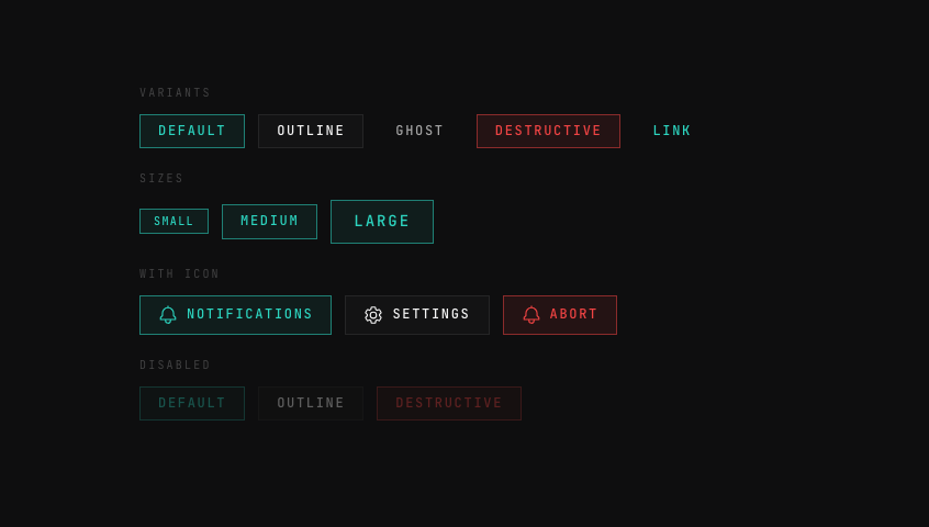
Components/Buttons & Toggles

Components/Buttons & Toggles

Andromeda Button

Andromeda Button

A sci-fi / blueprint-aesthetic button with five variants (default, outline, ghost, destructive, link), three sizes (small, medium, large), optional leading icon, and full hover / focus / active / disabled state coverage. Transparent hairline surfaces sit on a near-black canvas, with an electric-blue accent that brightens and glows on interaction.

View Component
Glass Toggle

Glass Toggle

On/off toggles with glass housing and liquid-feel spring animation. Track color transitions smoothly.

View Component
Emoji Burst

Emoji Burst

A button that explodes emojis outward in all directions. Five emoji sets cycle on each click.

View Component
Glitch Button

Glitch Button

A terminal-inspired button with a text scramble glitch effect on hover.

View Component
Blind Pull Toggle

Blind Pull Toggle

A dark/light mode toggle styled as a window-blind pull cord — click to yank the cord and watch the icon swap through a venetian-blind slat animation.

View Component
Taga Toggle

Taga Toggle

A playful pill toggle with an expressive face on the thumb — dead (×× eyes, flat mouth) when off, happy (arc eyes, big smile) when on. Track warms from grey to yellow.

View Component
Mark Toggle

Mark Toggle

An iOS-style pill toggle in warm earth and sand tones — the thumb carries a small icon that morphs from X to checkmark as it slides across.

View Component
Pill Toggle

Pill Toggle

A minimal iOS-style slider toggle — thumb glides between off (grey) and on (green) with a snappy spring. Fully responsive.

View Component
AI Canvas
Components51
  • Backgrounds12
  • Buttons & Toggles8
  • Navigation5
  • Widgets6
  • Cards & Modals9
  • Inputs & Controls5
  • Notifications3
  • Typography2
AboutContact

Love what you see?

Every coffee keeps this project alive and growing.

Buy me a coffee
AI Canvas